Each of the book covers below were made in five minutes or less using Microsoft Publisher, free fonts from the internet, and free images from Pixabay.com. You can find more information on how to do all of those things on our book cover resource page here.
A typical “amateur” or “homemade” cover usually consists of a snapshot or lower quality photograph and text that is not effective in balancing the space or providing an idea of what the genre of the book is. See example #1 below.
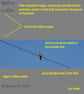
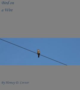 We’ve dissected the cover’s issues in the image below:
 Many authors would be inclined to “adjust” the above cover as a bandaid. Many times, we’ll see the cover below:
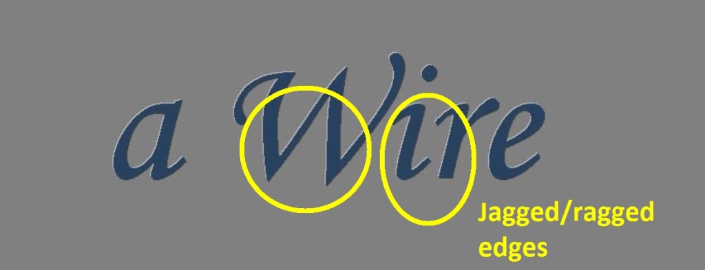
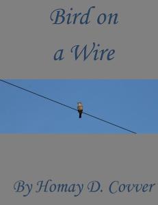 This new version still has a homemade feel to it, and the font Monotype Corsiva, while attractive, is not a display font which is designed to look smooth in larger sizes. Here is a close up of the jagged/ragged edges on the title lettering:
Obviously, the problems this cover has are not solved by this new version. What is the cover’s genre? Switching out the photo, the colors, and the font in just a few minutes can make a huge difference.
Grab some cartoon birds off Pixabay for free, download a lighthearted font, change it to matching, sensible colors, and voila, a cover for chicklit or comedy books:
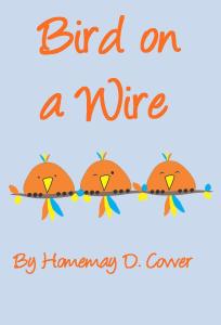 Writing fantasy? Just change the background color from baby blue to a color that works with your new image, get an image that represents the mood of your story, and download a free epic fantasy-style font.
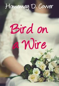
 The romance (women’s fiction, or romantic comedy) cover below was super easy. Just enlarge the photo (again, free, courtesy of Pixabay) to cover the entire canvas, then arrange the text so it is easy to read. Change the color to a “romantic” tone that has enough contrast and you have the cover below.
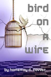
 Another example of enlarging an image (super neat one, too, thank you Pixabay) to cover the entire background is the literary fiction cover below. I downloaded a futuristic font and positioned the text so it wouldn’t interfere with the graphic.
 The horror cover below was the most difficult of all of these (still took only 5 minutes, though). Without the clouds behind the title, there was too much “white space.” So I found another eerie photo, cropped out the parts I didn’t want, darkened it, and laid it in behind the title. You can do all of that in Publisher. It’s still super easy.
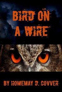 Publisher even let me match the color of the font to the color of the owl’s eyes. Pretty neat stuff.
Now, the real test: how do all of these look in thumbnail?
As you can see, the newer covers are much more attractive than the two original versions. They give readers a sense of the book, they are well balanced, colorful, and eye-catching. And they were each done in five minutes or less, and all for free. Indies Unlimited gives you the tools and the know-how to do this kind of thing yourself. What are you waiting for?
Note: We are not saying that ANYONE can make a good cover in five minutes. We’re just saying that’s how long it took our admin to do it. We’re saying that to illustrate that it doesn’t have to take an incredible amount of time if you take the time to learn how to do it. We’re not saying it will take a beginner five minutes. And if you hadn’t noticed, the author’s name is a pun, so the BY in front of it is not to be taken seriously. Sheesh, people. The rude comments we’ve received because of these misinterpretations have prompted us to turn off commenting on this page.

I agree that a book cover design means all the difference in whether a reader will pick up your book. I look at cover designs when I am searching for a book. If the cover represents the title, that in itself makes me want to know more of what is inside, behind that cover.
Exactly. A good cover should make that happen. Thanks, Vicki.
I’d point out that in general you should put simply “Homay D. Covver” for the author name, not “by Homay D. Covver”.