 Today I’ll show you how to upload your custom book cover using Createspace’s Cover Creator. First, you will have to have a design already made. If you’re using MS Publisher, we’ve got a tutorial for making your own book cover here. The same principles apply for print covers – just choose the size you need and landscape mode. If you don’t already have a design, take a look at the screen captures in this tutorial; they will give you a pretty good idea of what you’ll need to do before you start creating your awesome book cover. This tutorial will of course work for any size cover, but today, we’re working with one that is 6×9. Not sure what cover print book you should use? Laurie Boris asked readers what size book was best in this article.
Before we get started, here are a few hints for you:
- Whatever size cover you create, make sure there’s a ½ inch “safety zone” border all the way around it.
- Createspace will automatically reserve a spot on the bottom right-hand corner of the back cover for your ISBN number (if you used their free one), so you don’t have to worry about that. Just make sure that area is blank.
- A tiff file will have better resolution than a jpg, so if you’re creating your own file, or an artist is supplying it, see if they can get you a tiff.
Log into your Createspace account. Make sure you’ve already uploaded the text file for your book, or you won’t be able to access Cover Creator. Createspace needs file that to calculate the size of your cover. If you don’t have a text file yet, you can always upload a draft that will be the same amount of pages to see what size you need your cover to be. (I’ve done that many times to determine what I need to do for different book sizes and page counts.)
On the first cover screen, select your finish, and then how you want to make your cover. I always select “build your cover online.”
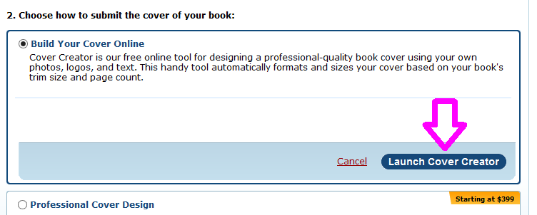
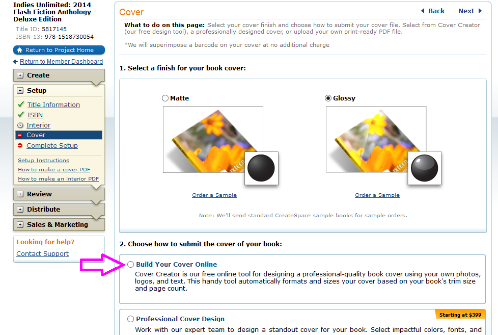 The window will expand as shown below. Click on “Launch Cover Creator.”
 That will open a new screen where you can choose a design.
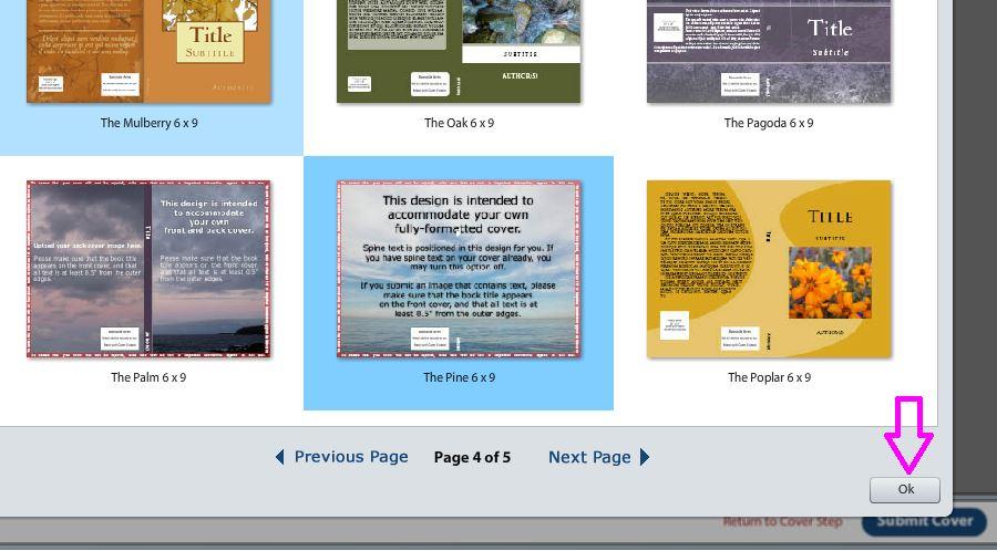
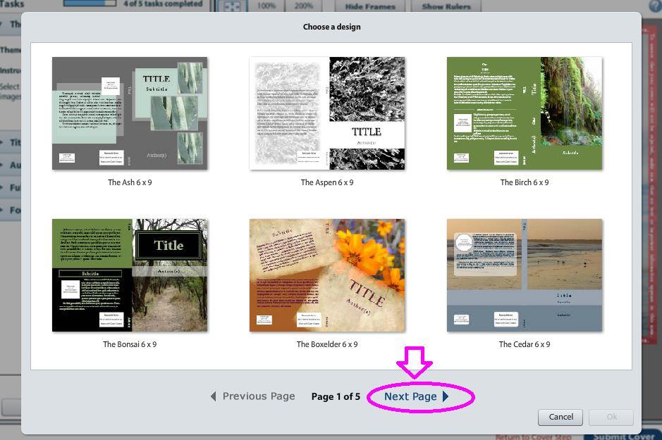 Down at the bottom, click “Next Page” until you are on page 4.
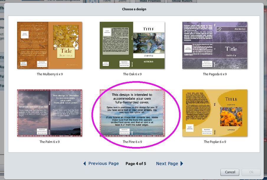 In the bottom, middle, you will see a cover template called “The Pine” which says “This design is intended to accommodate your own fully-formatted cover.” Click on The Pine once, and it will become highlighted in blue. Then click OK.
 This will open the Cover Creator canvas, if you will. Your navigation is to the left.
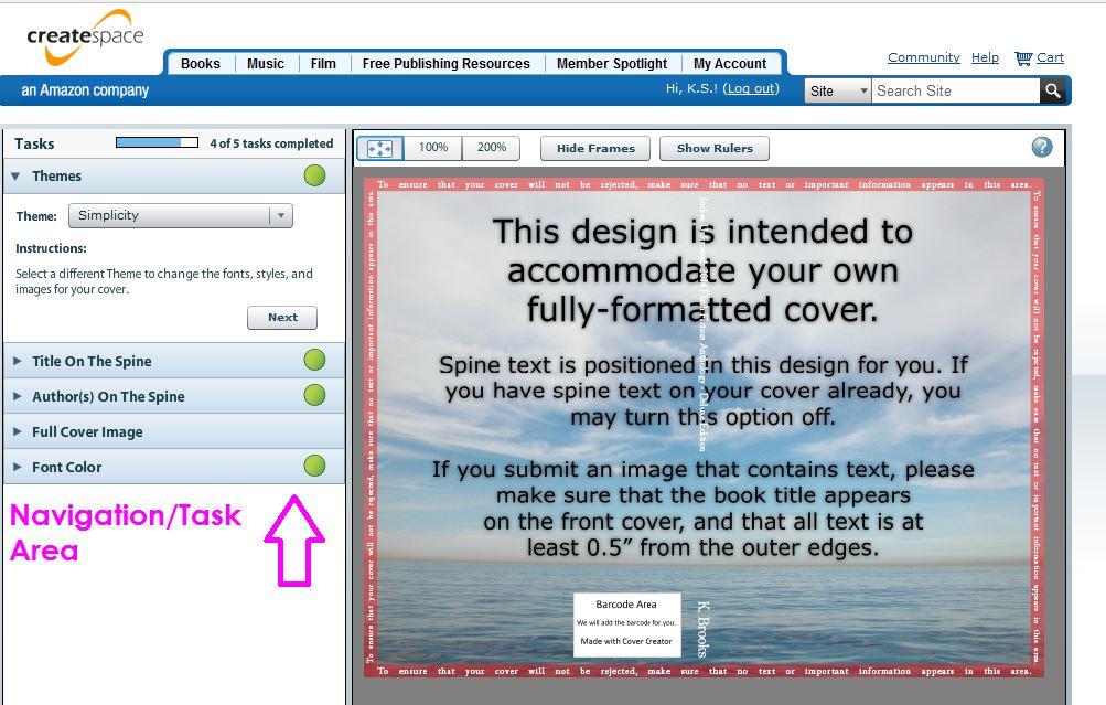 If you click on “Full Color Image,” that section will expand and will give you the dimensions your cover should be. In the case of the 6×9 book that we are making, the dimensions should be 13” wide by 9.5” high. This includes a ½ inch safety-zone. So make sure you don’t have any text in that safety area. Now you know what size to make your design in whatever program you are using. (As mentioned above, I am using MS Publisher.)
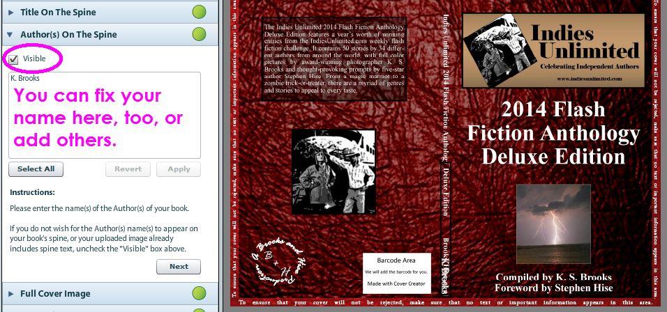
 Createspace very conveniently provides your spine text. (Notice it in white in the center of the canvas above.) Since mine is already included in my cover art, I won’t be using theirs, but I leave it up there so I can make sure my spine text is properly positioned. This is very handy if you are still designing your cover and you want to see where you should put your spine text. If you don’t want to deal with putting vertical text on your spine, you can just use theirs. You can turn it on and off as you like. But first, let’s upload our cover art.
Createspace recommends a jpg or tiff file. A tiff file has infinitely better resolution, so that’s what I recommend. You will see a notable improvement in quality in every way if you use a tiff. So let’s upload our design now. It’s pretty standard, like uploading to most sites. Click upload, and your browse window will open.
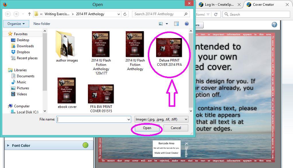 If you are uploading a tiff file, be patient, this could take a while. Once it’s done uploading, it will appear on your screen along with a bunch of viewing options.
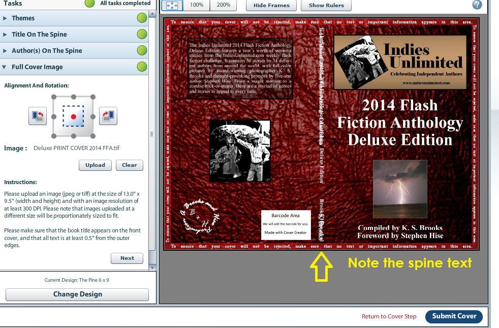 You will notice that Createspace’s spine is exactly over my spine text. Yay! If you have provided your own spine text, but it doesn’t line up, now is the time for you to go back to your design and tweak it into the right position. Pretty handy tool, eh? Now we’re going to turn off the spine text. In the left-hand navigational area, click on “Title on the Spine.” A window will expand.
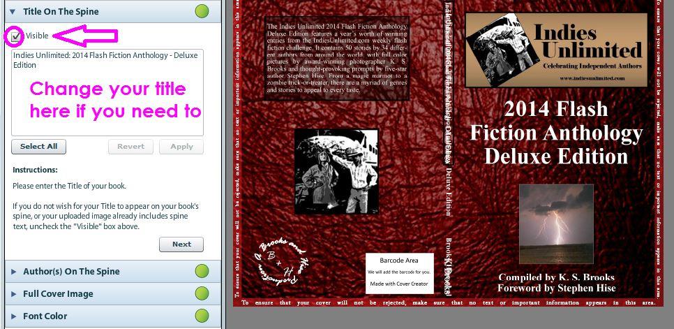 Here you can easily remove the text by unchecking “Visible” and/or you can change the wording of your title here as well. When you click the checkmark in the “Visible” box to remove it, the screen will think for a moment and then voila, the title text on the spine disappears.
Now we need to do the same thing for “Author(s) on the Spine.”
 Now, you can see your spine text clearly. Also, notice that Createspace has put a “safety perimeter marking” around the outside of your cover. Make sure no text or important information is in that area, or they will either reject your design or it runs the risk of being cut during their process. This is why it’s pretty important not to have borders, stripes, or lines on the outside of your design, because when it is trimmed, it may not come out perfectly straight.
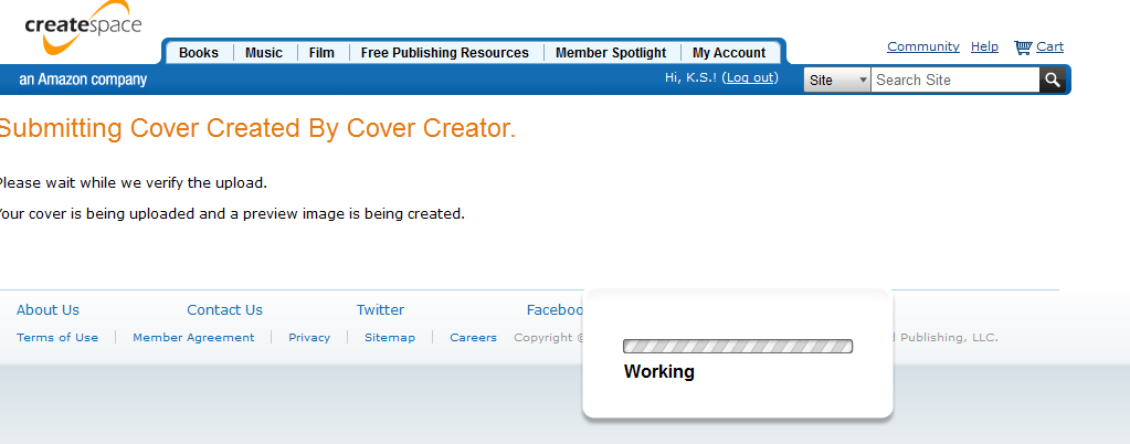
In order to finish your cover, make sure all the dots in the navigation bar on the left are green. If they are, and you are satisfied with your design, just click “Submit Cover” in the bottom right hand corner. This will bring up a screen that may take a while, especially if you’ve uploaded a tiff. Those files are large and take a while to process.
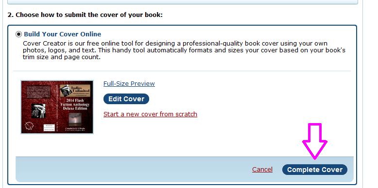
 You will be brought back to the original cover screen. Scroll down to #2 and you will see a tiny preview of your cover. You can click on Full-Size Preview if you want to see it in all its glory, or you can just go ahead and click “Complete Cover.”
 For some odd reason, when you do that, it scrolls back up to the top of that page while it’s “thinking.” Don’t worry about that. You’ll eventually notice that in the left sidebar, a green checkmark has appeared next to Cover. Then scroll to the bottom right and click save.
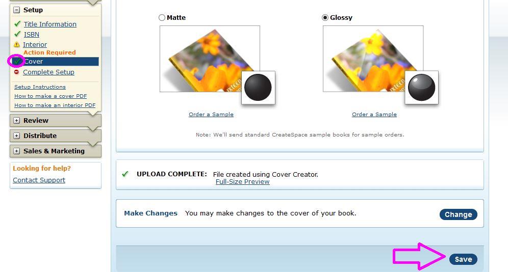 And there you have it! You’ve just uploaded your own cover. Congratulations. The rest of the process from here is easy. Just follow Createspace’s instructions. I ALWAYS check the online proof AND send myself a print proof for review. I’m not saying you have to have a print version of the proof, but it’s always a good idea to make sure things look how you want them to.
Next time, we’ll cover uploading a front cover and a back cover separately using the Cover Creator. Meanwhile, good luck with the rest of your publishing process!

So excited on many levels here. First, because while I use Createspace all the time, I have yet to upload my own cover (and have been wanting to). Next, it appears that the paperback version of the 2014 Anthology has just has a cover reveal? 🙂 🙂
Yes ma’am! Just waiting on the second print proofs. We caught a couple of minor things in the first proofs. Hope to have it released by the end of this week. 🙂
Excellent tutorial. I love CS’s Cover Creator; it’s very easy to use. I confess, however, that I usually upload jpgs. I’ll have to try a tiff on my next one. Thanks!
Thank you, ma’am! And yeah, I discovered tiffs really make an amazing difference. Let me know how you make out with that. 🙂
I use the Createspace cover creator that you’re going to be working on next, uploading front and back cover. I will now try out tiff files as I have always used jpegs. 🙂
Cool. I think you will find the level of quality is noticeable. Best of luck! 🙂
Great tutorial! The one caution I’d add to this is that a cover image needs to be 300 dpi minimum, or it will get flagged. I ran into trouble with this a couple of times because my cover would slip just below 300 dpi after making minor adjustments. I now work at 600 dpi to be safe.
I also strongly agree about getting a printed proof sent to you. I don’t know if it’s just me, but my covers tend to render darker in print than on my screen, and I often have to go back and brighten the overall cover image a bit.
True that on the lightening – I have noticed that in general with Createspace on interiors of my children’s books. I think it’s partially because our screens are backlit that they appear lighter/brighter than they do on paper. Thanks for stopping by, Bruce. 🙂
You’re right about the cover darkening. I use a calibrated monitor and design in Photoshop, and the CS prints still come out darker than designed. This does not happen for the books printed offset litho in bulk, so it must be something peculiar to the CS process. Worth bearing in mind if you’ve got a lot of subtle detail in the image!
Interesting! Thanks for letting us know. I just thought it was a general thing.
Thanks for the tutorial, Kat. I use the Palm template, which is just to the left of the Pine in your illustration above. That way I don’t have to mess with calculating the width of the spine — CreateSpace does it for me. I make a back cover to the same dimensions as my front cover, and upload both files. The trade-off is that I’m limited in font choice and spine color to CS’s stock offerings — but I consider it a fair trade for not having to figure out where to put my name and title on the spine.
Yup, I use the Pine for my calendars. I’ll be covering that one in the next tutorial. 🙂
You did it again. Great tutorial!
Aw, thank you, Phillip. 🙂
Kat – great tutorial.
I have made and loaded pdf files directly without using the cover builder. Is it better to use their Cover Builder? Is there a difference in the results? (I created cover files using a template from CS for size based on size & page count etc., then loaded & flattened the art work using Gimp into pdf file )
I have no idea, Elisabeth. I’d be curious to know the answer, but I would probably continue doing it the way I do because I use MS Publisher to make my covers and it’s so easy to just export it to a .tiff. I would say to compare the size of the PDF file to the size of the TIFF file Gimp can generate and that may help to determine it. I have been really happy with the results from a tiff.
Thanks Kat – I think an experiment is under way 🙂
Thanks for the info. I didn’t know you could upload your jpg and have CreateSpace add in the barcode and spine this way.
Hey, you’re welcome! 🙂
Oh, thanks for this. I am trying to figure out CreateSpace right now. I’m sending this link to my tablet so I can read it in depth. 🙂
My pleasure. The next tutorial will show how to upload a front and back cover separately, so stand by for that one. 🙂
Thank you, as always, for the invaluable and helpful information IU shares! ?
Glad to be of service. 🙂
Hi Kat! This was excellent and has gotten me thinking! I’d love to tackle my own. Sounds so easy.
I do have two questions. Did you use a template to make the double sided book cover on Publisher? I clicked the link for the tutorial in the article but that was for a cover only not including the back and the spine.
And, how do you get the sizes 13 x 9.5 if the page is 8.5 x 11?
Thanks- Roseanne
Hi Roseanne – thanks for your comment. All you have to do is change the size of your “canvas” in Publisher – when you open a “New” document, it will ask you what size you want. That’s when you can tell it the dimensions of the cover. And if you are interested in having Createspace do the spine for you, next week we’ll be covering how to upload and front and back separately to Createspace. It’s really easy.
Did it! Didn’t even know that was an option. Thank you. And this site is such a wealth of information. I always find helpful info on EVERYTHING! I know you are all volunteers and, once again, thank you!
You’re very welcome, Roseanne. Thanks for being here! 🙂