 As you are probably aware, back when IU was vetting books, the most common issue we saw with books during the process was an unclear or confusing book description. The second most common issue: unreadable titles on book covers in thumbnail size.
Who cares? Right? It’s just a tiny book cover. No one expects to read it in that size.
Um, wrong.
One of our most referenced articles is one that our Lynne Cantwell wrote about the Marketing Rule of 7 – that it takes at least seven instances of someone seeing your book before they actually purchase it. Well – what if those seven instances are in thumbnail size? Do you think they will remember to purchase a book when they can’t read the title? Moreover, will they even notice it to begin with? Probably not. Don’t waste a chance to get in front of someone and make an impression.
Here at Indies Unlimited, thumbnails are generally 120×177 pixels, which on my laptop ends up being around 1.75 inches high by just under 1.25 wide. There is no specific industry standard for thumbnails, (on WordPress it’s 150×150) and the size varies from site to site. Then, add to it people viewing sites on their tablets and cell phones – and you can end up with some mighty small thumbnails. Can you read your title under those circumstances? You may want to check.
This is one reason I dropped out of a number of author groups on Facebook. People would constantly post “What do you think of my cover?” and I would answer “I can’t read your title in thumbnail size” and they would get all pissy and say “Well I can read it just fine.” Um, okay – you know what it says already. Of course you can read it. The level of frustration was ridiculous, since for some reason I really do care and really do try to help people (which prompted this post about book covers with just a teensy tiny hint of snark).
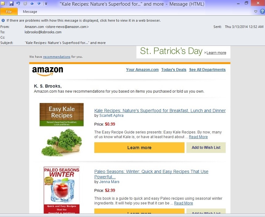
Seriously, I’m not making any of this up. Thumbnail-size book covers are the size most commonly viewed by shoppers. They go out in subscription-style reading list emails like The Fussy Librarian and Book Gorilla. They go out in Amazon.com “we think you’ll like this,” or as in the image below “Ms. Brooks, you need to go on a frikkin diet. We can see you when you’re on our site, so try these books.”
 Of course, shopping sites also use thumbnails to cram as many titles as possible onto a page. Amazon jams twenty bestsellers per page, and then, don’t forget the even tinier thumbnails off to the right for the Hot New Releases, etc.:
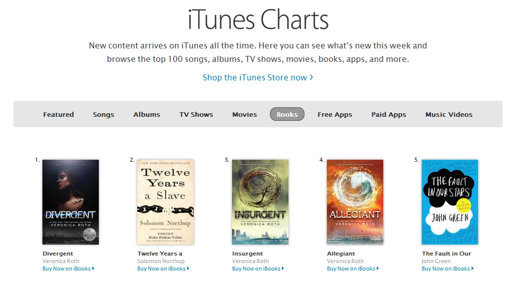
 The standard thumbnail on iTunes is a little larger, but still…
 And don’t forget Thrifty Thursday and Print Book Paradise here on Indies Unlimited (and our sidebar):
 Successful indie authors like Hugh Howey and J. A. Konrath have unmistakably legible titles:
[ezcol_1fifth]


Now, to prove the point about illegibility, unfortunately, I can say that most of the indie covers I’ve seen lately fall into this category. But, to avoid even more hate mail, I’m going to go with books from the bestsellers list on Amazon instead. I don’t know these people, and if they want to send me hate mail, I’ll reply with a copy of one of my books. With a note “notice you can read MY title. p.s., will you endorse me?” Because that’s how I roll.
[ezcol_1fifth]


Granted, some of these authors may just assume that their names will sell the books for them, but honestly – I can’t read their names either.
But I paid a designer to make my cover! Surely they know what they’re doing! Well – if you can’t read your title in thumbnail, perhaps they were more concerned with the design or aesthetics, and didn’t consider the potential impact on your livelihood. I notice quite often that authors and/or designers are reluctant to put type over a nice picture. Or, they blend the tone of the font in with the background. It’s as if they don’t want to disrupt or invade that space. How is the picture more important than your title, though? Kick it back to them. Make sure they do right by you, not just the design. Because really, do you want your cover remembered this way: “Besty, you should have seen the book cover I came across today on Amazon. Lovely hues of aqua and soft clouds – a very talented artist, I’m sure.” “Sounds pretty, Mabel. What book was it?” “Oh, you know? I don’t know. I couldn’t really make out the title. But the clouds were very nice!” Wow, that’s a sure sale if I ever heard one – NOT.
In any case, this should put this issue to bed for once and for all. It is obvious that I am correct, and that you should care very much whether your book’s title is legible in thumbnail size. Because I am right, and I am unanimous in that. You’re welcome.

LOL; yes, you are absolutely right. In my self-publishing classes, this is one thing that I harp on for all the above reasons. Why go to all the trouble of writing, editing, formatting and publishing a book if it’s going to molder away in the purgatory of unreadable titles? Excellent post.
I completely agree. When I had my cover designed I loved what Rebecca came up with but I asked her to make the script thicker to make it more readable in thumbnail. I don’t know about dimensions but if I have trouble reading it on the size of a postage stamp it won’t pass muster.
A lot to think about. And I’ll share this on a FB page for Kiwi indie authors, if I may.
But as I was reading this I kept thinking: ‘Don’t people click on the thumbnails if they’re that interested in a book cover?’
Cheers
– Paul Corrigan
Hi Paul, please feel free to share! Thank you. And if nothing strikes people about the cover, they have no reason to click on it. If they can’t discern the title – there’s no point, you know? Thanks again.
Right on the money as always, Kat. I remember the snark post, clicked the link, and can’t believe it was FIVE years ago! OMG!
Thanks, Chris! Yeah, it’s been a LONG time. Unfortunately, still seeing the same problems with covers each week. 🙁 Thanks for stopping by and commenting. <3
Checked mine – the TITLE is nice and clear at thumbnail size, just as I designed and created it so long ago. I am not a ‘name,’ so the title is more important right now.
That, and a ‘brand’ for the planned trilogy and its prequel short story.
After they’re finished, time to push the other things, such as my name.
Keep harping on this, Kat – maybe eventually people will listen…
With the trad covers, I suspect the designer is looking at impact on a bricks-and-mortar shelf. That’s where they get most of their sales. Ebook covers have to catch the eye in a much different environment. If your cover designer has been doing trad covers, you might gently point out to him/her that your biggest market is different, and requires a different approach. Heck, it’s worth a try.
Excellent point! 🙂