 As you are probably aware, back when IU was vetting books, the most common issue we saw with books during the process was an unclear or confusing book description. The second most common issue: unreadable titles on book covers in thumbnail size.
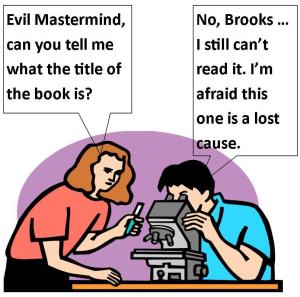
Who cares? Right? It’s just a tiny book cover. No one expects to read it in that size.
Um, wrong.
One of our most referenced articles is one that our Lynne Cantwell wrote about the Marketing Rule of 7 – that it takes at least seven instances of someone seeing your book before they actually purchase it. Well – what if those seven instances are in thumbnail size? Do you think they will remember to purchase a book when they can’t read the title? Moreover, will they even notice it to begin with? Probably not. Don’t waste a chance to get in front of someone and make an impression.
Here at Indies Unlimited, thumbnails are generally 120×177 pixels, which on my laptop ends up being around 1.75 inches high by just under 1.25 wide. There is no specific industry standard for thumbnails, (on WordPress it’s 150×150) and the size varies from site to site. Then, add to it people viewing sites on their tablets and cell phones – and you can end up with some mighty small thumbnails. Can you read your title under those circumstances? You may want to check. Continue reading “Book Titles in Thumbnail: Size Does Matter”


 Guest Post