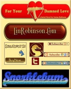
As promised, this tutorial will cover the making of buttons, logos, banners, and other graphic types needed by writers. Not as sexy an issue as covers, but very necessary. And it all applies: if you can create a cool-looking logo, you can create a cool-looking title and byline. In fact, if you examine this collection of images I think you’ll see that the difference between a “logo”, a “banner”, a “button”, and even a “title” is pretty abstract. What you’re seeing there, top to bottom, are: the title for an online serial, my personal logo I use for many things including “signatures” in mailings and forums, a custom SmashWords buy button, a dragon social media avatar, a Twitter button in custom colors, three RSS buttons to match three different sites, and a website header. All basically the same thing, using the same resources and simple skills.
And you’ll love this: it’s a lot easier to do these things. Your chances of learning, fairly quickly, to create good-looking, useful graphic doodads is virtually 100%. And there’s better news than that for those less than comfortable with all the talk of installing and learning graphics programs: you can do it all online without having your own programs, and it’s easier to do that way and at least as high quality! Cool, huh? Continue reading “Banners, Buttons, And Beads”

