 I’m constantly looking at book covers as part of my “job” here at Indies Unlimited. On top of that, I run into authors posting their covers in groups all the time, asking for input. So I see a LOT of covers. And most of them all have the same issues.
What I find most ironic is that the same people keep posting book covers with the same problems. I don’t get that. Please allow me to make something perfectly clear. And I’m not just making this up to be difficult or bossy or right. I’m speaking from experience. I used to provide my own cover art to my small Indie publisher – and because of that, I’ve taken some lumps. But I’ve also learned some important things about book covers. I share this knowledge freely, to help my fellow Indie authors. Book covers are important. We all want to make a good first impression. Book sales count on it.
But I’ve noticed that a lot of people don’t want to listen to my advice, but, silly me, I keep giving it in hopes that I can help someone, maybe… someday. What would happen if I started advising them to do the exact OPPOSITE of what should be done? Do you think maybe THEN they’d do the opposite just out of spite and end up with a decent cover? How about we give it a try? With that in mind, here are my top five tips for better book covers.
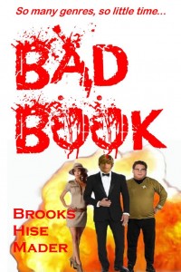
#1 – Black type on a dark background works great, as does white type on a light background, and so on. Frankly, I think titles should be camouflaged so that the reader has a challenge – what could be more fun? In fact, don’t be shy. Go all the way. Make the type and the background the SAME color. They’ll love that, really!
#2 – I see you’ve featured your name across the cover in a huge, bright-colored font. It looms over your title. Interesting. And it’s your first book, you say? So you have no name recognition? Hmmm. Okay, then. My thoughts? Forget the title, because, really, it’s just in the way. Turn that book sideways and make your name as big as possible. Yes, just your name. No one cares about the title anyway, so you might as well get rid of it.
#3 – Let me get this straight: the title of your book is Jody Goes to Hollywood, Book 1: the Zombies Who Kept Their Souls and Now Fight Crime and Eat Twizzlers Instead of Flesh Series? Honestly? That makes my head hurt. Oh, but it makes it hurt in a good way, of course. Riiiiiight. Question: why’d you stop there with the title? I mean, you have room for a few more keywords. Seriously, that title is not nearly long enough. You know what? Forget the keywords, you should probably just add the entire first paragraph of the book. That’ll get attention, I’m sure.
#4 – That font is really generic. I can’t tell what genre your book is supposed to be. Never mind that it’s slapped on top of what looks like a third grader’s pencil drawing. I’m guessing maybe you made that cover yourself? Good! Readers love that! It makes them feel “closer” to the author. The drawing has a special meaning, you say? They have to read the book to “get it” you say? Well, that’s even better! Because you know, of course they’ll read the entire book before they see the cover. That’s like an added bonus for people who buy your book. That’s pure genius! Wish I’d thought of it myself.
#5 – When I shrink your cover down into a thumbnail, I feel like I’m looking at a teeny tiny abstract painting. I really can’t make out the title or your name, or the image… But that’s okay! No, don’t worry about it, no one wants to be able to read your title when the cover is in thumbnail size. I mean, who besides every shopper on Amazon.com or Barnes & Noble or iTunes or any other online store is going to see your book in thumbnail size? Nah, don’t worry yourself with it! Readers carry magnifying glasses, and like I said in #1 – they love a challenge.
Yes, I’m thinking from now on that those will be my responses to people if they ask for my opinions on their cover designs. Either way, it’s a win, really. If they ignore me and do the opposite, they’ll end up with a better looking cover. If they actually implement those suggestions, then that should make it easier for my own books to get noticed. I’m really starting to like this idea. Now where are those Twizzlers? That zombie book made me hungry.
LOL
Well put and said. Maybe the new trick will do marvel 😉
Hey, I’m here to help, you know? 😉
Would love your opinion of mine?
Hi Keith, that never seems to go well, because people are incredibly protective of their covers and are easily offended by helpful input. But, since you asked – I just took a look at your cover and suggest you read this article – https://indiesunlimited.com/2014/07/25/title-envy/ I hope that’s helpful. (Don’t mind the snark, there is an actual positive message in there.)
Oh, now I know why I don’t sell more books. My name isn’t big enough. (head palm)
With your last name, you could probably split it over three or four lines – that’d be super cool. 😉
Come on; tell us how you REALLY feel.
Shhhhhh….
I must make my titles longer and more ‘telling’. I must have my name printed in a larger font. Oh, and I must make my cover images more complex to set a real challenge for the reader, whoever the heck he is.
I’ve been thinking for some time that it might be time to change all my covers. Having seen how others have done this and produced some real impact, it makes sense. Time for a clean-up and a new image methinks.
Thanks for the prompt Kat. 🙂
You bet! I think it’s a good idea to update covers from time-to-time – I’m actually in the process of doing most of mine right now as well. 🙂
Great tips! May I also suggest that authors forget any kind of color scheme/thematic/layout continuity between covers, especially for series? Where’s the fun in having someone recognize your next book based just on the cover?
Like I said, readers like a challenge, so that’s a great idea! 😉
Reverse psychology at its best, Kat. 😀
Thank you, ma’am! 🙂
Dear Kat,
Thank you for all the wonderful ideas. But now I have to redo all my covers, because I didn’t follow your advice even once. It sure is nice to have Indies Unlimited around, with experienced authors I can look up to and learn from.
Gotta go. Lots of covers to upgrade.
Thanks again.
PS
I’m having a little trouble with #2 and #3. If I have a huge font for the author name, how do I find room for the 17-word title? I’m sure you, as an experienced cover designer, have a way to manage this. Boy, I sure wish I was as good as you!
Oh snarky one, I think you are doing just fine. 😉
There’s a student of mine I must send this to!
Thank you
pdr
Uh oh! LOL Thanks. 🙂
You cover it all, K.S. Brooks. Except one thing. In my opinion too much STUFF on the cover detracts and makes it look crowded. I know from personal experience.
My cover designer and I tried and tried to get the background plus three other objects on the cover. I thought I needed all three. But no matter how we arranged them, something wasn’t right. We dropped one of the objects and now I love the cover.
That is a good point, and I feel that kind of falls under the “abstract” mess, though. Glad things worked out with your book.
This may be what’s wrong with my covers. They have multiple images and whilst they all seem to have been well enough received by those who have bought printed copies, and the images are all drawn from ones in each book, but I’m coming rapidly to the conclusion that a simpler design could be more effective.
Thanks for raising this subject. My designer and I are now going to have serious discussions!
Love this. Thanks for the smiles.
Glad to. Thanks. 🙂
Loved your humorous approach to this… I plead guilty to some of these, 4 and 5 in particular. Now I’ll be hunting for an idea for a new cover for my short story book. Practice makes perfect eventually.
Thank you
Joe
Glad I could help, Joe. 🙂
Great article. As a writing coach, I see so many indie writers make these mistakes all the time. Having no contrast between the font and the background of the cover, and having too long of a title are probably the biggest mistakes a newbie author could make.
I know it’s harsh when we first enter that hard cold world of marketing and sales, but indie writers will benefit immensely by remembering that potential readers spend a maximum of three seconds to decide whether or not they want to learn more about a book. Three seconds. So a good first impression really is everything.
Awesome tips here, thanks so much!
Thanks, Lauren! I appreciate the support. 🙂
I’ve been changing my covers to better fit these guidelines (in their opposites, course) but, especially with books for my target audience, I notice a lot of covers with great art but titles that are thin, script style fonts in colors that barely pop off the underlying graphic. It’s like these authors and, in a couple of cases, their small press publishers, don’t want readers to see the title. Reading these titles in thumbnail is a huge problem and it has to be hurting sales.
Two author friends with a lot of books between them just started their own publishing company and brought several new, first time, authors into the fold. So far, they’ve released three books for three new authors. All had title font size and font color problems. They’ve learned little about covers in all their years of doing their own stuff. It’s really disheartening to see.
You are right on the money with that, Anne. It’s nice to know that someone else sees it. Thanks for letting us know. 🙂