 We all know the number one goal for us authors is to write a kick-ass book. However, a kick-ass book that no one reads or ever knows about doesn’t amount to much. We may know how great it is, but a little outside validation would be nice. Enter goal number two: a kick-ass cover. Yes, it’s a secondary goal, but it’s actually primary to our book marketing and promotion. I tend to think of the cover of a book as a door. It may invite us inside, or it may bar the way. It may entice us with mystery or bore us with blandness. It may beckon with romantic tension, or spur us on our way with horrific shivers.
And part of the problem is that we, as the authors, know what the book is about. We know what happens inside, but our readers don’t. We have to create a cover that will convey a sense of the story without giving away the store. So how will we know if our cover is appealing? How will we know if the cover identifies our genre and gives an enticing idea of the story?
Ages ago, I wrote a spiritual fantasy about a future time when a geologic holocaust has decimated the human population and destroyed civilization. The few survivors have returned to a Goddess-based and earth-based spirituality as they await the appearance of a female savior. I had two titles in mind, She Rises, and Goddess Rising. As my publisher was getting the interior of the book ready, I tackled the cover.
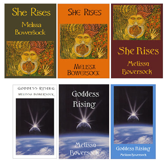
I had two images that I really liked. One was by Meinrad Craighead, one of my favorite artists in the world. She was raised Catholic and was a nun for several years, but her upbringing also blended in an awareness of the Goddess and a reverence for the earth. One of her paintings I particularly liked is called Mother and Daughter. The image portrays a strong relationship of woman to woman in all its many guises. The second image was a painting by Dennis Davidson called Spatium Lux. Instead of the warm, earthy colors of Meinrad’s, it was space art, cool and dramatic. I liked both of them, and couldn’t decide between them, so I chose to get more opinions.
 First I dummied up several simple cover ideas in Word, using the title She Rises for the Meinrad covers and Goddess Rising for the space covers. I created a new webpage off my main site and loaded up all my cover samples there. Then I invited my friends to pop over, take a look and give me feedback. I asked for input on (1) the title, (2) the colors, (3) the font, and (4) the layout.
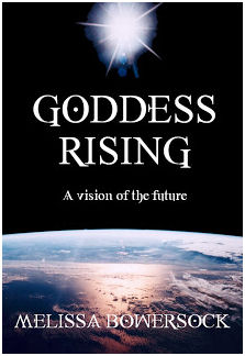
I was actually surprised when the majority of respondents preferred the space art and the title Goddess Rising. Not only that, but serendipitously, I just happened to come across a NASA photo that I could buy for just $10 that was just as stunning as the space painting I’d been playing with. Tweaking the layout and the fonts with my publisher, I soon had the kick-ass attention-grabbing cover that I wanted.
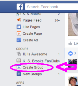
 Now, as I said, this was ages ago. I know many authors do not do their own webpages, but have someone else build and maintain them, so it might be more difficult to create a place for your focus group there. The good news is, you can do the same thing today with Facebook. It’s easy enough to create a new group (there’s a link on the left-hand side of your FB feed), and you can make it public or secret as you like. Either way, you can add friends, fans, and family as members and have them weigh in on your ideas. Facebook groups can come in handy for more than just cover feedback; if you start early enough, you can use that group to coordinate beta readers, ARC readers, and more. If you’re brave enough to commit to fully public reactions, you could do the same thing on your regular FB page, Pinterest, or your blog. It’s always a good idea to have multiple sets of eyes on your cover design, and you might be surprised by the reactions. And the most important thing is, it’s better to hear the criticism before you publish than after. Remember, it’s hard to see the big picture when you’re inside the frame.

Better still, join a group like Indies Unlimited, and get involved with everyone’s covers, blurbs, Amazon complaints, house moving, and anything else that Indies talk about 🙂
Yup, that works, too! Thanks for adding that, Gordon.
That’s an interesting idea. I never would have thought of it. 🙂
Just one way of many to get public reactions to what we’re doing and thinking. And it’s SO much easier now than when I started!
I had a similar problem of deciding between several book covers too. I found a group on Amazon forum that looked at book covers and offered free advice which I took. I believe it helped me sell more books. I don’t if the group still exists as I haven’t used it recently. I find it helps to have a third eye looking at your covers, especially one that isn’t in love with one cover or the other.
Excellent idea, and one I wouldn’t have thought of. Thanks for adding that. I’ll bet there’s a lot of ways to cultivate focus groups like this that we don’t know about.
It’s a great idea. I know that when I formulate covers, I get WAY close to the project and then need a reality check. Thanks, Melissa.
Reality check is right! I also find that I may love an idea at first, but then after I look at it for a while, not so much. I have to really take my time and consider the things others see that I don’t.
I’ve just finished another manuscript in my African Memoirs series and now need to get round to thinking about the cover, so this has been a most timely and helpful post. Thank you, Melissa.
Even better, it has given me an idea of what to do about another problem – my title. I wrote the draft with one title in mind, but not really convinced that it gave the right impression or grabbed potential readers’ attention. After reading your post I’m going to develop a focus group and see what others suggest. But how do I go about it? They can’t all read the whole thing, that would take too long and end up in literary critique rather than title suggestions, so I’ll write some synoptic bullet points and use them to invite ideas.
This could be fun. Watch this space – or my FB page for results.
You might think about crafting your blurb first, and use that to give your focus group an impression of the story and the title. As with all things indie, there’s no one “right” way to do it. When I did this focus group for my cover, none of my group had read the book, so they were going on my blurb and short description. Good luck, and let us know how it turns out!
Wow, thanks for sharing your process, Melissa. While I loved the painting by the former nun for the cover, after seeing it next to the space and NASA covers, its impact was completely overshadowed by the modern-looking cover. The fact that you decided to use a focus group almost certainly increased your sales.
I think all of us need to do this! Another suggestion: for those who have an indie publisher, or who are contemplating hiring a professional cover designer, be certain that they have experience in designing for, or at least understand, your genre (voice of experience!)
Good point, Candace. Good idea to always check their past work and even get references.
I noticed you did not mention how your book did when it was first published in 2001 or since 2001. How did it do sales wise? And how is it doing now? In 2001 Author C Clark’s 2001 was all the rage with space exploration. However, since then the categories have add more apocalyptic, paranormal, spirituality and fantasy writtings. You may want to see if tastes have changed for your cover and as an experiment pull together a new focus group and review your cover based on the markets changes in taste over time. I would not be surprised if they suggested something totally different for today’s market. If you do please let us know if a new cover is suggested. Thank you.
Joe, you make some excellent points. I have updated several of my covers, but not this one. This book actually does not sell a lot; I think it’s got a very narrow demographic, a niche interest. And that’s okay. But you make an interesting case for changing the cover. Hmm… I’ll have to think on that. Thanks for adding to the discussion. I would not have thought of that.