 In a previous post I discussed various methods of conducting a survey on your website and a different post even conducted an extensive survey. Finally, here is the promised tutorial on how to do your own survey using Google Forms, the same method as was used in the survey we conducted.
While you can do this by the seat of your pants, if the survey you’re planning is going to have a lot of questions, especially if the answer to some questions is going to determine whether or not to ask follow up questions, it might make sense to rough out the survey, either on paper (maybe index cards) or in a word processor where you can easily rearrange. However, we’re going to fly by the seat of our pants today.
Step one to go to Google Drive. If you don’t have an account with Google, you’ll need to sign up for one. If you do, you may need to sign in. If you have an android device that accesses Google Play (or I’m guessing if you publish your book to that store), have a blog on Blogger, or a Gmail or YouTube account, you have an account already. Use it.
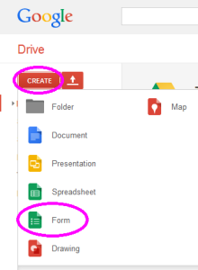
Once signed in, click the big red create button in the top left corner of the screen. You’ll be given several choices, pick “form.” (See diagram to upper left.)
This will open a page in a different browser tab like the one below. I’ve started filling it out already. Near the top in the area labeled “Form Settings” you have three choices.
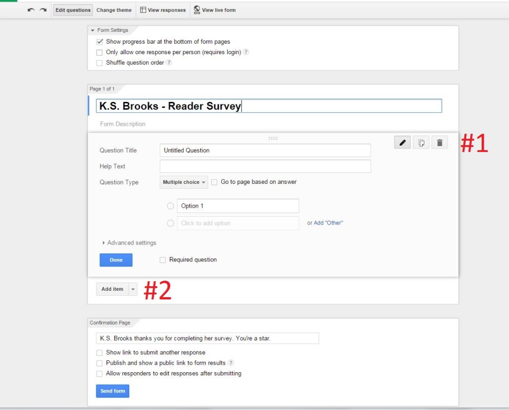 A form or survey can have multiple pages. Checking the first box displays a progress bar at the bottom of each page which provides an estimate of how close the user is to completing the form or survey. I’ve chosen to select this.
The second setting limits the survey to one response per person. This particular setting is the key to the biggest Achilles’ heel in using this tool for some purposes. Leaving this button unselected means that any particular user could answer the questions multiple times. If there is a reason respondents might be motivated to do that, but having that happen is going to make the information you’re gathering unreliable, you’d want to select this button. However, the only method of signing in is a Google account. That option limits the people who can or will respond. Depending on your situation, this might make this tool unsuitable and is the biggest weakness in the tool, at least in my opinion. I’ve left this button unchecked.
The third setting is to shuffle question order which I’ve also left unchecked. Choosing this option will shuffle the order of questions on each page. If your questions stand alone and it is possible that asking one question might influence how a respondent answers a question that follows, using this option will help alleviate any bias caused by the order of questions.
You’ll notice that I’ve also changed the name of the form (You’ll see a default value of “Untitled Form” prior to entering what you want it called.) At the bottom of the page is a section labeled “Confirmation Page.” This has a message to be displayed when a respondent submits their answers at the end of the survey. I’ve changed the default value, because Ms Brooks would want that. There are three other options in this section.
“Show link to submit another response” is selected by default. I’ve unselected it. For a survey, this doesn’t make sense to use. Filling out forms for some other purpose, it might.
The second option in this section, “Publish and show a public link to form results” is a way to direct someone who has completed the survey to a page that summarizes the answers thus far. If you don’t want people having access to this information until you’ve collected all responses, you’ll want to make sure this option is not selected.
Last, is the option to allow responders to edit their response after they’ve submitted the completed survey. Picking this option doesn’t make sense except in the context of requiring a login and limiting the survey to one response per person (two of the options in the form settings section at the top we discussed earlier).
Now it’s time to add some questions. You’ll see in the picture above that the initial blank survey inserted a single multiple choice question as a default. There are four types of questions that make sense for a survey. One of them, a grid, I’ll leave for you to explore on your own. The others (multiple choice, check box, and choose from a list) are much the same. All give choices, with slightly different rules for answering and methods for making your selection. The multiple choice and check box options are exactly the same except the multiple choice type allows only one answer while the check box lets the respondent select all that apply.
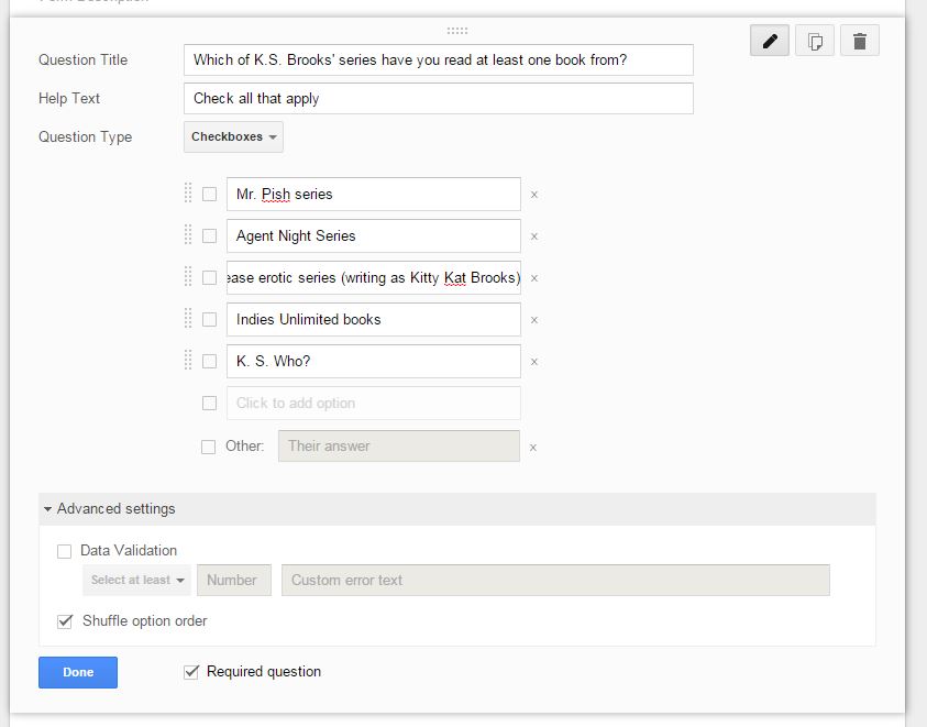 We’ll start with a checkbox. Enter your question (don’t forget a question mark). In the help text area, you can leave it blank or enter any prompts that might help the respondent better understand how to answer. Change the question type from multiple choice to checkbox. Modify ‘Option 1’ to have your first choice, click in the box below that to enter a second option. You’ll see how to continue adding more options until you’re done. If you need to delete an option entered in error, the X to the right of the option box will do it. If you’d like to rearrange the order of the options, hover over the two rows of dots to the left of that option until the cursor changes to look like criss-crossing arrows, then drag and drop the option to where you want it. Clicking the “Add Other” link at the bottom will add a final option of “other” with a text box to explain their answer. I’ve done that in my example. You can require a question be answered by clicking the “required question” box. You can also shuffle the order of the choices for just this question (the option selected in the “Advanced settings” option). There is also an option unique to this question type to require at least a certain number of boxes be selected or to reject the answer if they’ve selected more than a certain number. Now our first question is ready to go; all I have to do is click “Done.”
Looking at the initial default screen above you’ll see some icons just to the left of the big red #1 label. These icons will disappear once you hit the ‘done’ button. However, if you need to go back to change or correct a question, you can hover over the area of the page with the question you need to modify and the icons will appear. The one on the left is to edit. This will open up the question and allow you to make modifications. Hit ‘done’ once your changes are completed. The middle icon is to copy. It will make a second question exactly like the one you’re copying. This has many potential uses, for example if you’re asking several different questions with the same choices for answers. Copying, then modifying the second question will save you having to enter the list of answers multiple times. Last, the icon on the right will delete the question.
Adding a multiple choice or choose from a list question works much the same as the check box type we did above. Clicking on the down arrow on the right side of the button that says “Add Item” (marked with the big red #2 in the picture above) will give you some item choices. I’ll pick multiple choice question to show a few subtle differences between it and the check box question type.
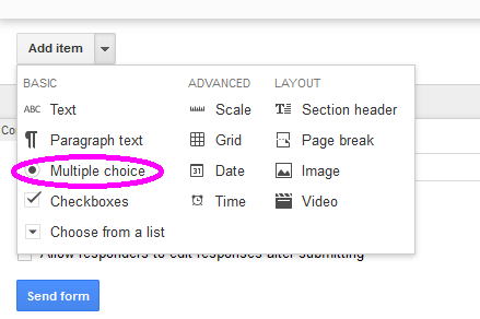
Initially the blank multiple choice form looks almost exactly like the check box form. The differences are circles rather than boxes displayed to the left of the options (a visual cue that indicates whether a question will take a single or multiple selections) and the box that says “Go to page based on answer.” Clicking on that box adds the drop down box to the right of each option that by default will say “Continue to next page.” Here I’ve completed a multiple choice question (You’ll note that I took the easy way, copying the last question, changing its type, deleting the ‘other’ option, and selecting “Go to page based on answer.”)
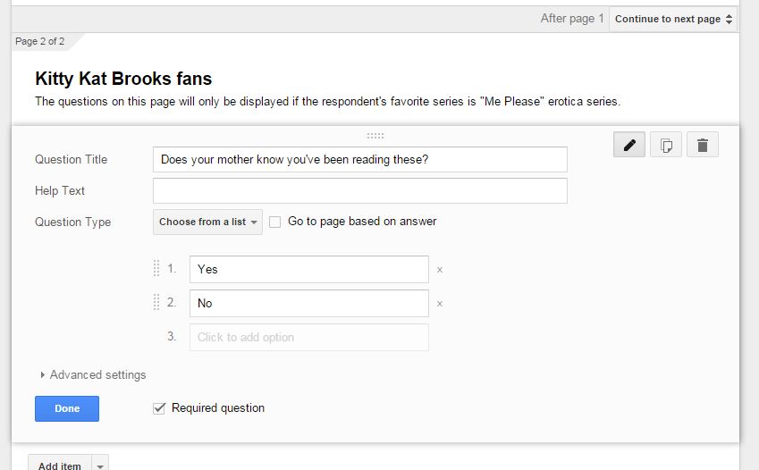
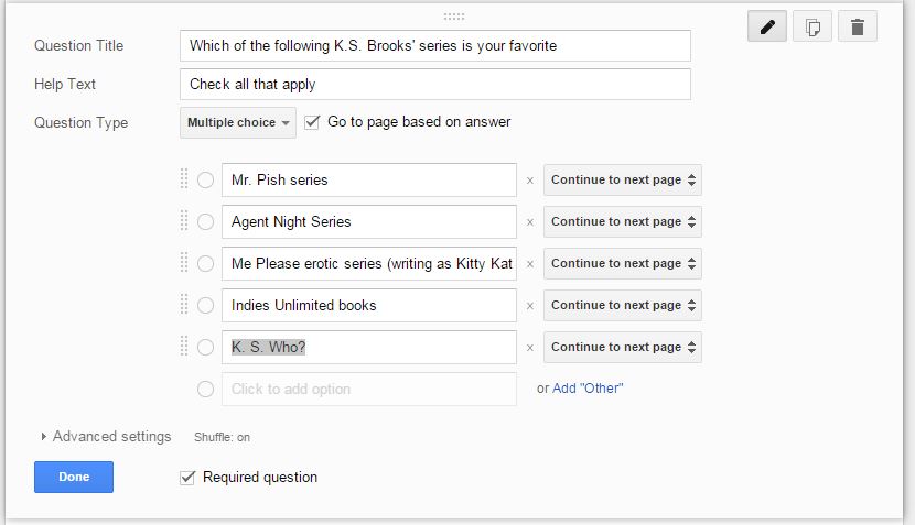 We’re almost done. You may have noticed that I left the place to go on the last question as the default next page. Now I’m going to change that. First add a page break by clicking on the arrow next to “Add Item” and making the obvious choice for this purpose, fill out the two items for a page break (these can be blanked out if you wish). Next I’ll add a “Choose from a list” type question and complete it. This is what those look like once done.
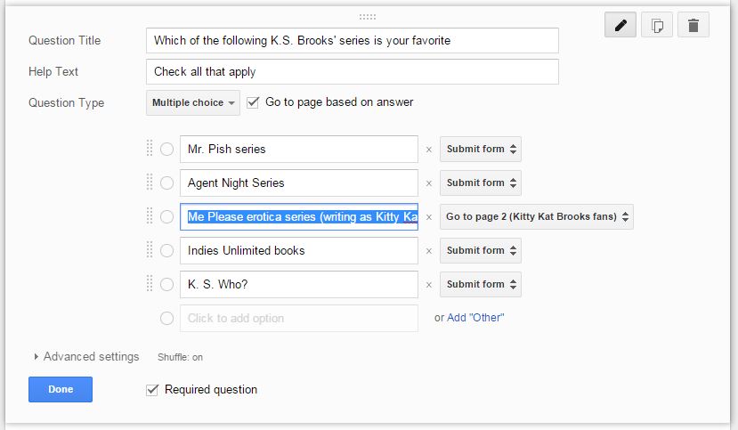
 Now we’re ready to go back and modify the multiple choice question to jump to the appropriate spot. This will be the end of the form for most of the possible answers. I could have left the one question that continues to a different page as the next page and it would work the same, as long as the order of questions isn’t changed. (To change the question order, you’ll find that hovering near the top left of a section for a question or other items will change the look of the cursor and you can drag and drop questions to rearrange, just like moving answer choices within a single question.)
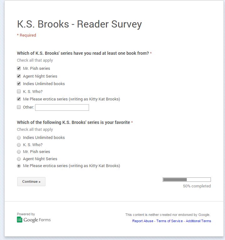
 At any point you can click on the “View Live Form” button at the top to get a better feel for how the form will look and function. Here are examples of the two pages in the survey we’ve just created.
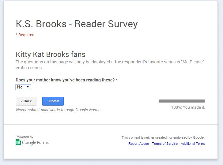 Here are a few more things you’ll need to know.
Clicking on “View Responses” at the top of the screen will do exactly what you think, open a new tab that will show the responses received thus far. (This page can also be accessed by choosing a file on the Google Drive main screen. Get there by clicking the green box on the top left. The file for responses will by default have the name of your form plus “Responses.”) Clicking on “File” (near the top left) when on the responses screen has an option to download the file in several formats, an Excel spreadsheet being the most logical choice. Last, clicking on ‘file’ on the form definition tab has a choice of “Embed.” If you choose that a box will pop up with some HTML that should be copy/pasted into your webpage. (If you use Blogger or Word Press, switch the editor to HTML mode before pasting.)
These directions may sound complicated, but if you have a blog or website you’ve almost surely done tasks that are comparable. It’s easy. I promise.

Good post. I’ve used Google Forms before, and they’re a great way to grab responses without having to code the html (particularly the backend scripts). This was a good explanation of how it’s done.
Thanks, RJ. I agree, it is a great way to go.
If I ever decide to put a survey on my blog, I’ll be back here to figure out how to do it. Thanks for the info, Al. 🙂
Good luck, Lynne. And if you can’t figure it out, I guess you know who to come to. 🙂
This looks like it could be a lot of fun. And, the media tends to love surveys and considers them “newsworthy” – so it makes sense for authors to use them. Thanks, Al. *she wrote, contemplating a survey about a certain reviewer*
I was going to mention in my reply to Lynne that someone thought this looked complicated, but I resisted. Now I’m regretting that decision. 🙂
Thanks, Kat. It really isn’t as hard as it looks. (Much easier than juggling everything on a Word Press blog.)