 The debate continues, but I’m back to tell you yes, you can format and upload your eBook manuscript in Microsoft Word. My last post led us through the process of getting rid of all the junk, hidden code, and other weirdness . Now we’re ready to format.
There are many ways of performing the same action in Word. I start with setting up my styles.
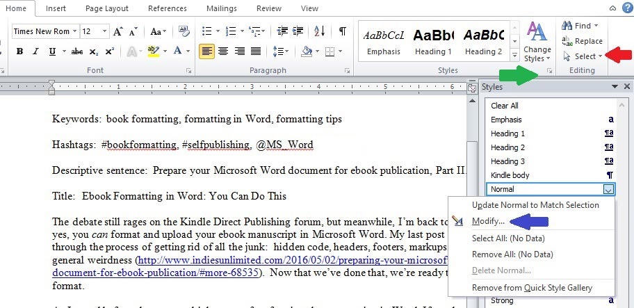
From the Home page, select the entire (you can use CONTROL and A to select all) document (red arrow below) and go up to the tiny arrow under Change Styles (green arrow below). Click that and you get a list of styles from which to choose. I go to Normal and choose Modify (blue arrow below).
These are the default Word settings. I change them. Under Formatting (red arrow below), I set the font to Times New Roman (very close to the Kindle defaults of Caecilia and Bookerly). I change the font size to 12.
Now we’ll look at the paragraph spacing. See where it says “After: 10 point” (blue arrow below)? That means there will be extra space between paragraphs (as discussed here) and we don’t want that. Click the tiny set of arrows on the right (green arrow below) to remove the extra space.
Our font is set, so click on Format (purple arrow below) and choose Paragraph. 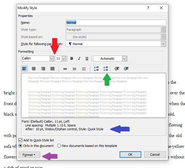 See Alignment (red arrow)? That’s another argument on discussion boards.
Why justify? If your manuscript isn’t justified, the Look Inside is ragged right. Some people feel that looks unprofessional.
Why not justify? Kindles automatically justify the manuscript (but not the Look Inside). When justified is set in the manuscript it can override the ability for readers to select “ragged right,” if that’s what they prefer. Some formatters recommend against justifying the manuscript for this reason. Others recommend justifying so the Look Inside looks nice and crisp. That’s something the author has to decide.
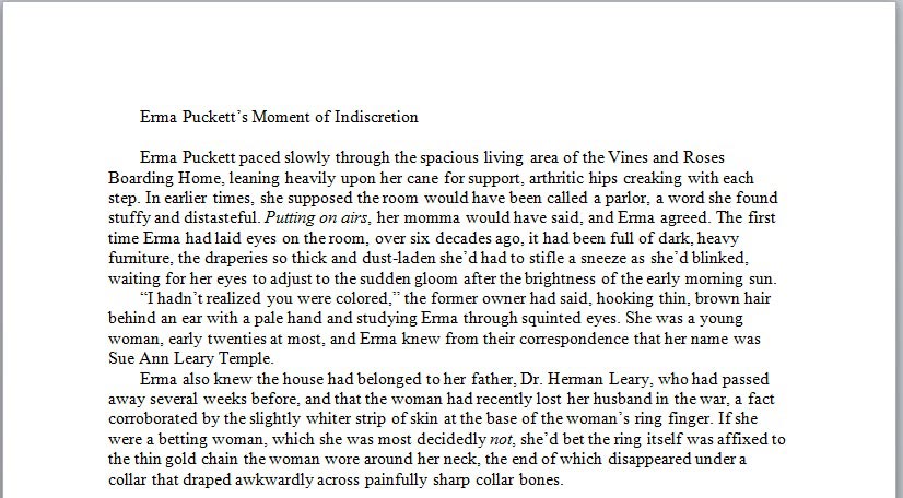
I leave the default in place at “Left.” To set indentation go to Special (blue arrow below), select First Line from the dropdown, and set it to 0.3. Set Spacing (green arrow below) to “0” at both Before and After (again, to remove blank lines between paragraphs). Set Line Spacing (purple arrow below) to single. Click “Okay” on both of your style boxes to close them. 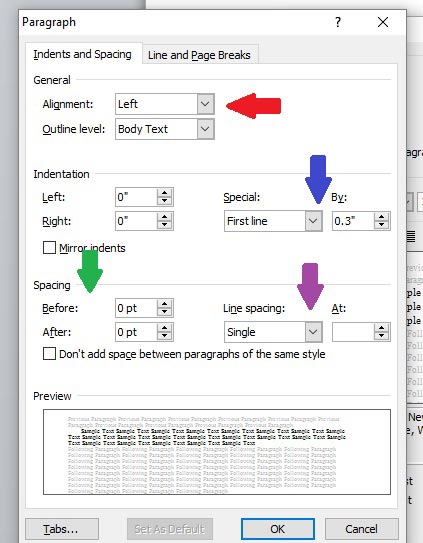 Your manuscript will now look something like this:
  Next: page breaks. Click the pilcrow (paragraph symbol) on the Home toolbar to show your formatting. Scroll to the end of your first chapter and space down twice. Click Insert on the toolbar (red arrow below) and Page Break (green arrow below).
You’ll see the break inserted (blue arrow below), and be taken to the top of the next page, where you’ll type your heading for the next chapter. Do this at the end of each chapter and you’ll have a nicely spaced manuscript without hitting “Enter” repeatedly, which can cause problems when uploading to Kindle. 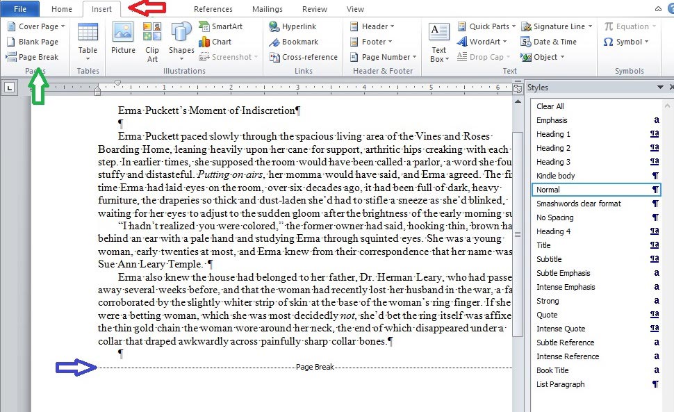 Next: chapter headings. See how my chapter heading is indented? Review how to fix that by clicking on the Tips for Formatting Your Book Correctly in Microsoft Word link above.
Then go back to Change Styles and click the arrow by Heading 1. Again, click to Modify.
Another box pops up showing our default settings. Go to Formatting (red arrow below) and change it to Times New Roman 14 (or 16, but that’s going to look really big on a Kindle). See how we have space before and after again (blue arrow below)? Go up to the set of arrows again (purple arrow) and click to get the spaces down to zero. Click to center your heading (green arrow below). Then click “Okay.” 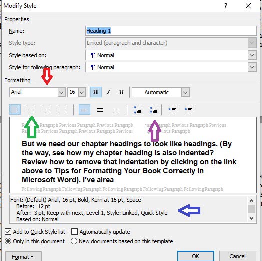 Highlight your chapter heading, then go back to your styles box and click Heading 1. Presto! Your chapter heading is centered, Times New Roman 14 font, with no extra spaces above or below. It should look like this:
  Do this for each chapter heading.
Once you have your chapter headings formatted go up to your Table of Contents page (which should be before your first chapter), place your cursor where you want the TOC inserted, and from the Home page click References (red arrow below), then Table of Contents (blue arrow below). From that dropdown, click Insert Table of Contents. This brings up another box. If you click Modify (red arrow below), you’re taken to modify font styles again. Ours are already set for Times New Roman 12, so we’ll leave it. I like my TOC centered so I set that and click “Okay” to exit the “Modify” box.
Make sure the box that says Show Page Numbers is NOT checked (green arrow below). eBooks don’t have page numbers. I only have one level of heading so I set the dropdown to “1” (blue arrow below). Click “Okay.”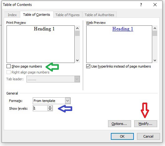 You now have a linked Table of Contents. Hover your mouse over it and you’ll see it’s “live.”
 There you have it: down and dirty Word formatting for Kindle. Feeling more confident? Check out this article for ways to make it prettier.

Thank you for this post!
You’re welcome, Wendy!
Good to see someone tackling this. I’ve been a professional editor/formatter for eBooks, as well as print, since 2010 and find it amusing with some of the errors people make in their books. Not that I’m laughing at anyone, in fact I’ve tried showing some people how to do formatting properly and even sent Word files to a few as a template they can save and use over and over (which I myself use, so I don’t have to start from scratch with each new book I write), but even then I get emails from them saying it doesn’t get accepted at Smashwords, so when I check their files I find they’ve inadvertently changed something critical. The bottom line is that most creative people are not good at what I term the “clerical side” of publishing and those who are turn out to be rarities.
Again, thanks for helping those who need it, but remind them also that hiring a professional editor is a must so we can cut back on the books being published that have so many grammatical errors their books tend to be unreadable.
Thanks, Jacob. It’s a difficult process to explain to people. I learned Word formatting the hard way, when a dissertation committee kept ripping apart my dissertation. Let’s just say I was very motivated to master the issues and get out of there! I took screen shots, printed them out, and referred to them over and over again until I “got” it.
I’m still learning. Word can do a lot of things. It can also do a lot of things *wrong* if a person doesn’t know how to use it. A substantial number of people on discussion forums state it can’t be done, and if done, will never look professional. I disagree with those sentiments. For a basic novel, formatting in Word most certainly can be done, and if done correctly, will look just as professional as a manuscript formatted with different software.
As for editing, yes, yes, yes. IU has tons of posts discussing the importance of editing: https://indiesunlimited.com/?s=editing
In the formatting guide on Amazon, it recommends putting some kind of spacing (I use “2”) in “after,” rather than none (0). I’ve always followed Amazon’s guidelines. Is there some reason why I shouldn’t from now on? Thanks for your help!
For a novel there should be indents for new paragraphs throughout the body (with the exception of the first paragraph of a chapter or new section), but no extra space between paragraphs. For non-fiction, a lot of people choose to do away with paragraph indents and instead, have the extra space between paragraphs (block paragraphs).
The mistake a lot of new authors make is in using both – paragraph indents, and extra space between paragraphs. According to the Chicago Manual of Style, that’s wrong because each action represents a new paragraph – we shouldn’t use both. If you look at traditionally published novels, they use paragraph indents instead of extra space between paragraphs.
Here’s a nice write-up explaining more: http://www.thebookdesigner.com/2012/04/paragraphing-style/
Some people do choose to add a “2” in “after” for chapter headings, just to give a little extra space between the heading and the body. My first ones were formatted that way, but I’ve since just spaced one time after the chapter heading and set “after” to “0.”
Thanks for explaining and for including the link. I always indent “3” for new paragraphs, but I also use “2 pts” after. In the Kindle Previewer, on my Kindle, and on iPad, no extra space appears between the paragraphs; everything looks normal. That’s why I was curious!
In the future, I’ll try “0” and see if my eBook looks different/better.
Two for “after” is tiny, probably not enough to show on any of the devices. My old publisher must have used 6 or higher – very noticeable!
Melinda, this is fantastic! Thank you for ‘splaining it all so clearly. <3
You’re welcome – hope it helps!
Great how-to, Melinda!
Thank you! 🙂
I’m with Linda Lee, using the “3 after” setting between paragraphs (as well as indents). Again, following a standard style guide. In general, it makes the page look less crowded; in specific, it makes the paragraph break clearer in those cases where the line before the paragraph goes right to the edge of the text block.
The only time it’s a bit weird is when you have a bunch of one-line dialogue; that looks too spaced out on the page.
Hi, Gordon. Two points “after” works best, even with a lot of one-liners on the page. Indenting three points for a paragraph gives an eBook a professional look. I can’t take credit for the ratio; I followed the formatting guide on Amazon from three years ago.
On a side note: A double space between parts/sections on iPads and Galaxy tablets does not always convert properly via the Kindle apps (mobi). I now use asterisks between parts instead of an extra blank space.