 Four years ago, I wrote a post titled “Drop Caps, Indents, and Other Formatting Tricks in Word.” Regarding drop caps, I mentioned that Word drops and enlarges the first character, which, if you’re writing dialogue, means it’s your quotation mark that gets dropped and enlarged instead of the first letter. Some authors and editors get around this issue by simply leaving off the opening quotation mark.
At the end of that discussion, I said: “There are those who believe leaving off the first quote mark is confusing to readers. Luckily, there’s a workaround in Word for those who want the quote mark, but it’s time consuming. More on that in a future post.”
I’m a little late with that future post (sorry, Anthony!). Truthfully, my workaround stopped working momentarily after a Word update, but it’s back now. It’s a wonky sort of workaround, but it does work. Remember, though, this is for paperbacks and hardbacks. Mobi and epub files don’t like drop caps and have been known to randomly scatter them throughout the document, so I avoid using them for ebooks. For print books, I turn my Word document into a PDF before uploading so that everything stays where I put it.
As I explained in my previous post, Word drops the first character, so if we have dialogue, it ends up dropping the quotation mark, which looks … well, awful:

Luckily, if you’re set on using drop caps, there’s a solution. A weird one, but hey ….
First, type your dialogue without the opening quotation mark and insert your drop cap as you normally would:

I’ll use my previous sentence to demonstrate below. You’ll notice there’s a text box around my dropped first letter:
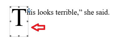
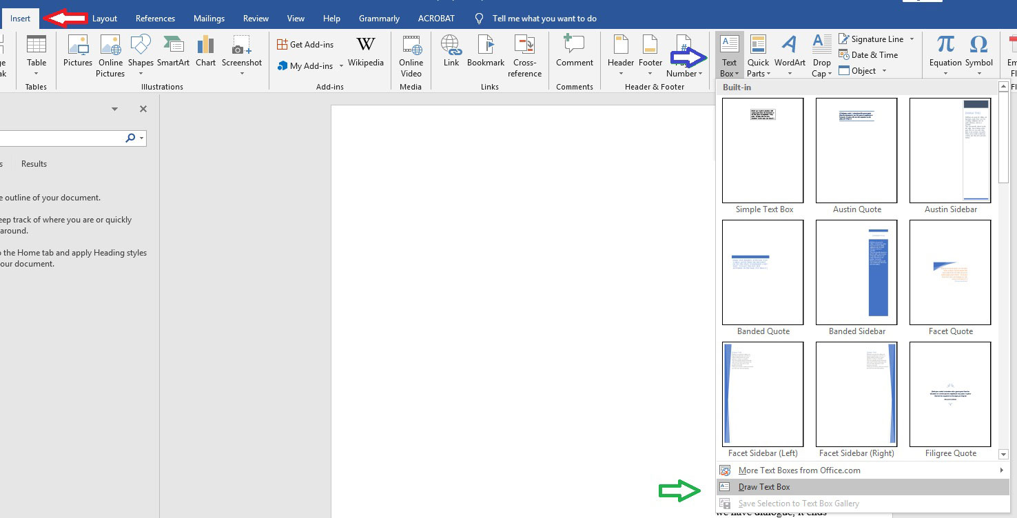
Here’s where it gets a little weird. You want to insert a text box into that text box. Go up to your tool bar and click “Insert” (red arrow below), then choose “Text box” (blue arrow below), and select “Draw text box” (green arrow below).
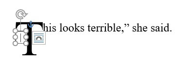
You’re going to draw that text box inside the text box around your dropped letter (see below).
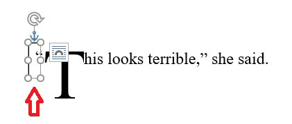
Once you’ve done that, type your quotation mark into the interior text box, then grab the handles of the interior text box to drag it where you want it (red arrow below).
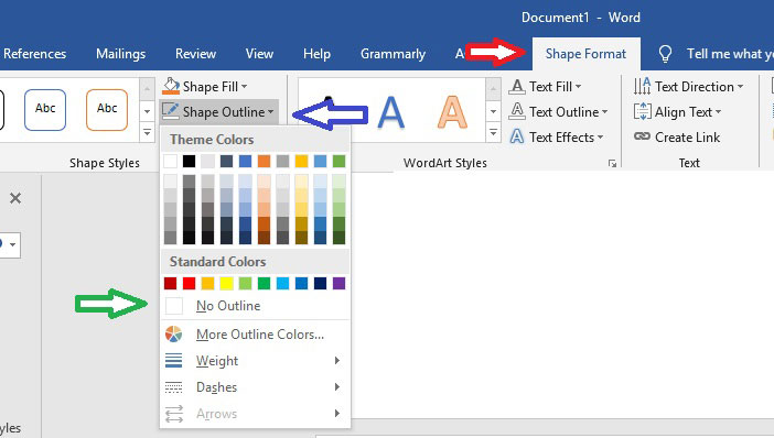
Now we need to get rid of the box around our quotation mark. Click on the interior text box, then go up to your toolbar again and click on “Shape format” (red arrow below). Click on “Shape Outline” (blue arrow below) and select “No Outline” (green arrow below).
Voila, a drop cap with the opening quotation mark:
If you begin a lot of chapters with dialogue, this could get tedious, but at least you now know it is possible!

Hmm. Interesting solution, Melinda. Thanks.
What about an inline image? If you had one for each letter of the alphabet, it would be a quick action to insert the appropriate image — and it should work for ebooks as well. I’ve never used drop caps, but I wonder …
Hi Kathy – I’ve actually played around with inline images before. One problem is that the insertion of the image causes the space between lines (the “leading,” I believe it’s called) to increase to accommodate the size of the inserted image. That’s not necessarily a problem, if the author/formatter doesn’t mind the space being bigger.
A well-known ebook formatter once told me inserting inline images in an ebook wouldn’t work because the reader can increase or decrease the text size but the image size will remain the same. I didn’t find that to be true. When I played around with an inline image in a mobi file, the image increased or decreased right along with the text. The leading was still off, but at least the image aligned with the size of the text.
I don’t use drop caps for anything as I find them rather distracting as a reader, but…another option might be to create sections for each chapter in which the first sentence is dialogue. Then, each of these non-standard chapters could be formatted without drop caps.
If you had lots of chapters with dialogue like this, sections be rather tedious as well, but at least they might provide another kind of workaround.
I used drop caps in my first three, but since then I just put the first three or so words in all caps (one size smaller). Easier, and also works in ebooks. 🙂
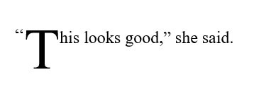
Hmmm. I played around with a quick test file in Word that I uploaded to my site as a PDF. I used Word’s formatting to align the graphic.
https://kathysteinemann.com/test.pdf
The letter T was thrown together in a rush. Images could be created with better spacing to tighten up the look. What do you think, Melinda?
Oooh, I like that! It offers up all sorts of possibilities! Imagine using something like the fancy letter graphic at the top of this post ….
Kewl! Feel free to grab a screen print and post it here if you want. 🙂 I left more white space at the top and left of the graphic than necessary. It would probably work better with zero spacing, because Word automatically spaces around images. Just a sec while I redo it …
Yup. Looks better.
I’ll share the word!
Thank you so much Melinda!
You’re welcome! Sorry I was a bit late with it …. 🙂