 I know it’s been a while since I promised to show y’all how to use GIMP to make a cover for a box set, but I have an excuse. See, as soon as Bob Hammond heard about it, he immediately demanded that I make him one. The delay has been due to his dithering over which of his many, many titles to include. I finally prevailed upon him to pick three so I could get going on it. He wasn’t happy, but he agreed. He even sent me an image to use for the cover. What a guy, huh?
So what’s this GIMP thing? The short answer is that it’s a lot like Photoshop, but it’s free. You can download a free copy of GIMP here. The longer answer is that GIMP (GNU Image Manipulation Program) is a powerful graphics program, and for most of us making our own book covers, it has more power than we need. It’s also developed by a community, which is cool in some ways, but brings its own little quirks. If you’re familiar with Photoshop, GIMP may confuse you because some of the commands have different names and may be in different places than you’re used to.
On the other hand, GIMP will make you a nice, free cover for your box set.
Still with me? Okay, here we go.
First, an orientation: GIMP opens with a blank desktop. To get a new canvas to work on, hit File – New.
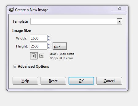
Mine opens automatically to 1600×2560 pixels, because those are the dimensions I use for my book covers, but you can set it to anything you want. You can also change from 72 ppi (Kindle resolution) to 300 ppi (CreateSpace resolution) by clicking the plus sign next to Advanced Options. But Bob is only doing an eBook, so 72 ppi is fine. Clicking OK gives us a blank canvas that’s pre-filled with whatever color is set as the background color. How did it decide which color to use?
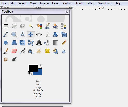
That setting is in the Toolbox window that lives on the left side of your screen. See the two colored rectangles toward the bottom of the box? The top one is your foreground color (FG in GIMPspeak) and the bottom one is your background (BG) color. You can change either one by clicking on the one you want to change. That brings up a dialog box where you can play around with colors to your heart’s content. Once you find a color you like, click OK to get out of the dialog box, then click the Bucket tool, and click on your canvas. Poof – color change.
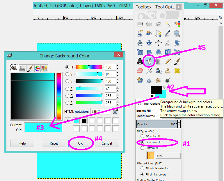 On the right side of your screen is another floating window with a couple of useful tabs.
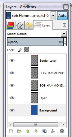
If you’re starting from scratch, you may need to make the adjustments below (to get the same screen that I am on, but it’s not necessary since we are not going to use gradients): 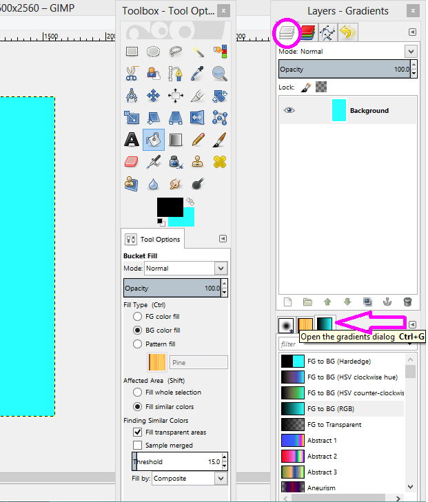 Like Photoshop, GIMP manipulates images in layers. Think of it as stacking pieces of paper on top of one another. If you want to edit one layer but not the others, just click on the layer in this list that you want to mess with. Your bottom layer is always going to be at the bottom of the list; transparent layers have that gray checkerboard background.
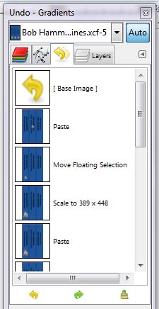
The Undo tab (above) can be a lifesaver. Your most recent edit is listed at the bottom of this list. If you’ve completely screwed up, you can save yourself by clicking on the last edit you made before you started screwing up. (For lesser screwups, there’s also an Undo/Redo command under Edit in the menu bar.)
So let’s start our box, shall we? One thing to keep in mind is that you will need six surfaces for your box, even though no one will ever see the top, bottom, and back sides. So for the sides that won’t show, you can use the blank canvas you just created. Save it with some name or other and leave it open so the box-making feature can find it.

Bob has already given me a front cover, so I don’t need to make one of those – although I am going to open it and leave it open. (GIMP defaults to opening new images in a new window under the one you’re working in. If you open a photo but don’t see it pop up, check your other open windows – it’s there.)
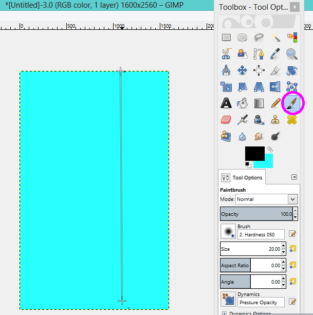
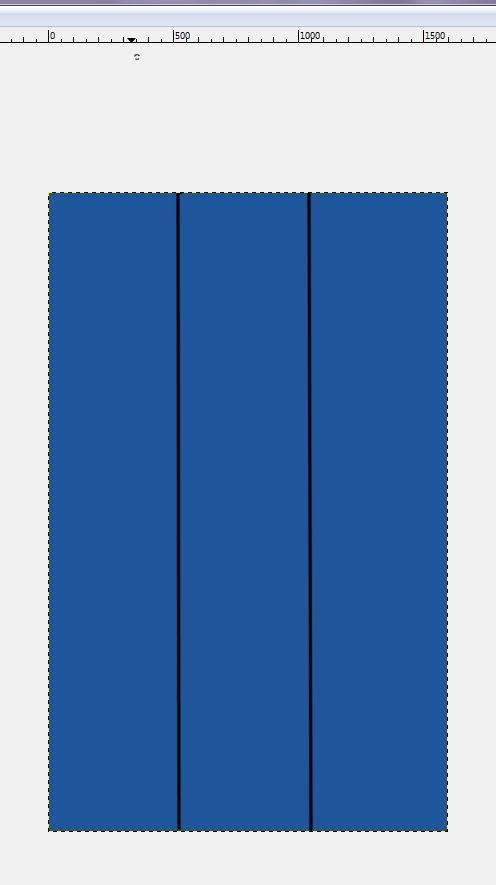
We need to make the side with the titles, so let’s open a new canvas and fill it with our color of choice. Now we need straight lines to separate the books, right? Here’s what to do: Select the Paintbrush tool; click on the place at the top of the box where we want the line to start; hold down the Shift key and use the mouse (don’t hold the mouse button down) to pull the cursor down to the place at the bottom where we want the line to end, and click there; let up on the Shift key. Presto! Repeat as needed.
When you’re done, it should look like this:
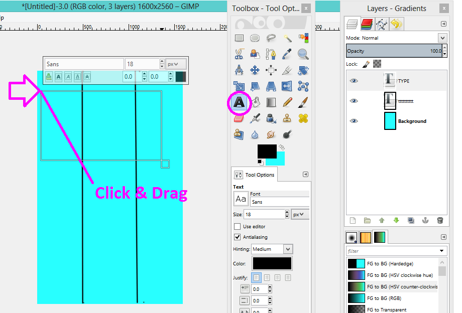
Next, the text. Click the tool that looks like a capital A and draw a text box on the canvas. Pick your font and size in the dialog box under your Toolbox, and type in your title (make sure to place the text box over your cover or your text will not show).
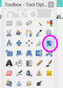
 But how to get your text to go sideways? Just click on the Rotate tool (in my photo of the Toolbox, it’s second from left in the second row from the top). On other versions, it may vary.
Clicking on that will bring up a dialog box.
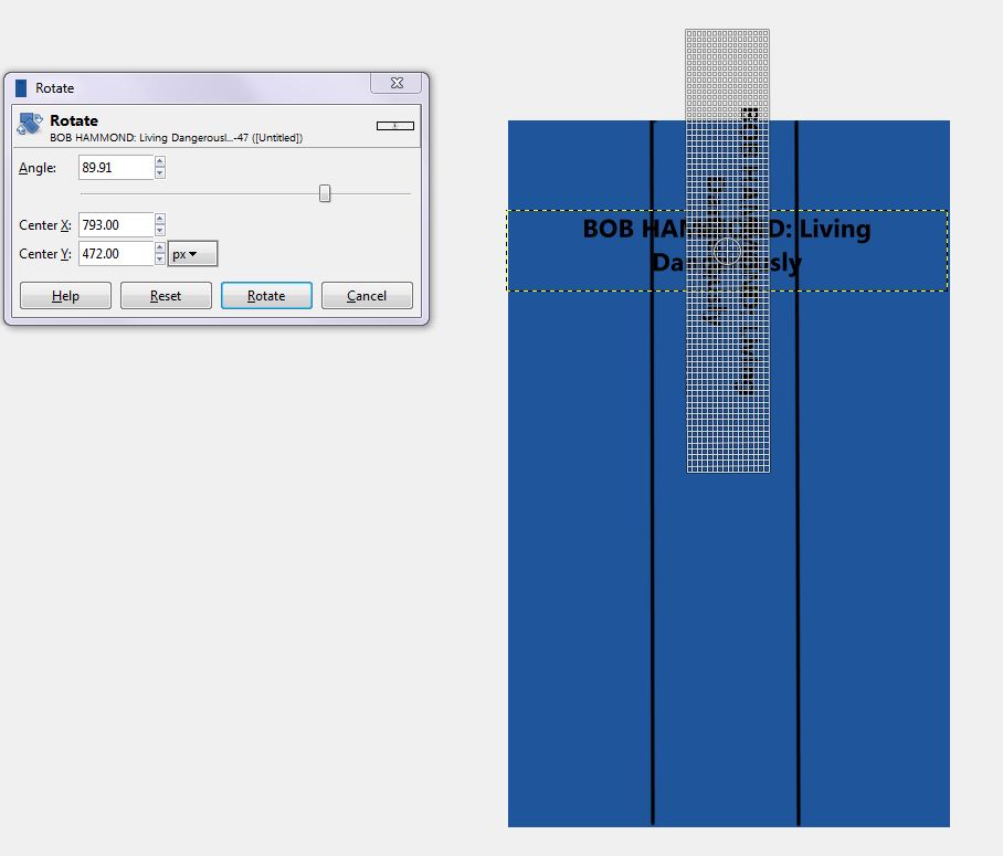
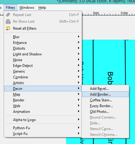
Clicking on the text box now puts little graph squares all over it. Grab a corner of the box to swing it around, and grab the cross-in-a-circle to drag it where you want it to live. When you’re happy with it, click Rotate. Repeat for each title. (I also added Bob’s photo to each book. And I put a border around the whole thing to simulate the edge of a box. You can find that under Filters – Décor – Add Border.)
When you’ve got all that done, right-click and pick Layer – Merge Down.
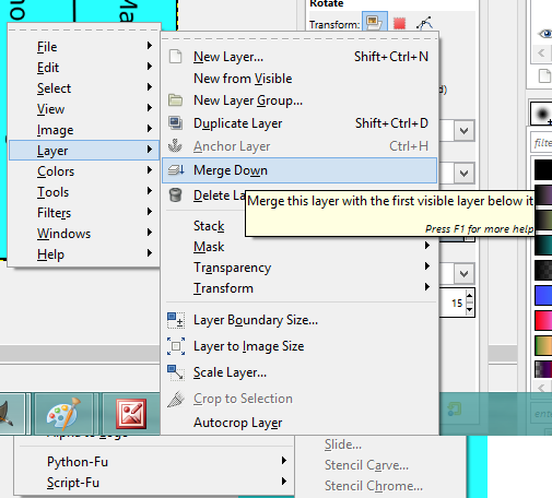
Leave this open, too.
At last, we can start to build our box! Open a new blank canvas (I filled mine with white). Go to Filters – Map – Map Object. That brings up a dialog box similar to this.
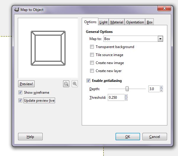
On the Options tab, under General Options, pick Box from the drop-down menu on the right. On the left, keep both “Show wireframe and “Update preview live” checked – it slows down the process a little, but it will give you a visual reference for the changes you’re making.
Next, go to the Orientation tab.
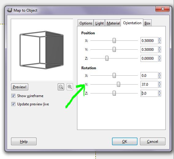
We need to angle the box so we can see the titles. Under Rotation, I’ve set the Y value to 37. Play around with it and see what works for you.
Now we can add the pictures! Click the Box tab.
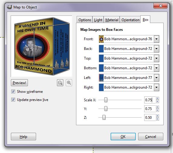
The drop-down arrows will let you pick among the pages you have open. (Hint: If you forget the “merge down” step for the title side of your box, you’ll get options to add each bit of that image by itself – i.e., one book title and that’s it. Ask me how I know this.) Pick your front cover for the Front, your title image for the Left, and your blank canvas for everything else. Also on this tab, you can set the scale for your box. I’ve set the X and Y values to .75 and left Z at .50. (Ignore how squatty the book looks in this preview; it’s because the preview window is square. Your final image will be taller than it is wide, so .75 of the area of the canvas will be just about right.)
Now, adjust the lighting. Click the Light tab.
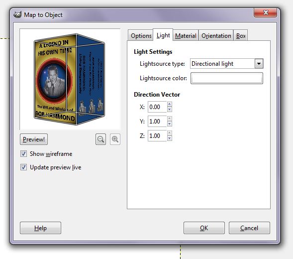
I’ve set the type to Directional light, the X vector to 0, and the Y vector to 1.00. Feel free to play around with it yourself.
At last, we are ready. Click OK and go get a cup of coffee while GIMP makes your box for you. It will take a few minutes. The green progress bar at the bottom of your screen will tell you how far along you are.
Ta-da!
 I’ve added a drop shadow by going to Filters – Light and Shadow – Drop Shadow and filling in the dialog box.
GIMP’s native file format is .xcf, but Amazon won’t accept that. So the very last thing you need to do is convert your file to a format the Zon will accept. GIMP calls that “exporting.” To do it, go to File – Export. In the dialog box, pick where on your computer you want to save the file. Name your file at the top of the screen, including the extension for the kind of graphics file you want it to be (I usually use .jpg), and click OK. This will bring up another dialog box (you can fiddle with your export settings here if you want, but I never bother). Click OK again, and you’re done!

I wish I had the courage to tackle this. Wow!
It’s not for the faint of heart. But 3D utility is a neat feature. 🙂
Thanks, Lynne. I use Gimp a fair amount, but I had no idea you could do that box thing. Good to know.
You’re welcome, RJ. 🙂
Ooooh! Is pretty much all I have to say. Can’t wait to try this, thank you Lynne.
You’re welcome, Carolyn! If it ends up not making sense, it’s totally Bob’s fault. 😀
I made that book cover look really good. I can understand how it was very distracting for you, Linda.
Yes, Bob, you da man.
This one has messed with Gimp and have decided to leave it to the experts who know how to deal with it’s eccentricities! I know when to turn it over to someone who is better equipped to manage it. But would love to have someone sit with me as I play with a program like that! 🙂 thank you for the info Lynne!
You’re welcome, Wendy! 🙂 I’m no expert on GIMP — not by a long shot! — but I just keep fiddling with the features ’til I get something I like. And I use “undo” a LOT. 😀
Thank you for the walk through, Lynne. My head hurts. 🙂
Thanks, Shawn. If you think this is bad, you should have seen me when I kept stopping to take the screen shots. 😀
Thanks Lynne – great instructions. I like using Gimp but would never had know how to do a 3d box. You are very helpful.
You’re welcome, Elisabeth! 🙂
We can’t thank you enough for illustrating how to use GIMP, with step-by-step instructions. Your time, effort, and knowledge are much appreciated, Lynne!
You’re welcome, Linda! 🙂
Very cool! I love Paint Shop Pro, but this looks like fun. Now show me how to carve out a chunk of play time, please.
Sorry, Melissa — there’s only so much I can do. 😀
I’ve had GIMP for a while but it always seemed SO complex that I got intimidated and gave up. Your step-by-step directions seem much easier than fooling around on my own. Thanks for the help.
Good luck with it, Kae! 🙂
Wow. This is scary and intriguing at the same time. Of course Bob looks amazing on his new cover. Thanks for the tutorial.
Bob always looks amazing. And I’d say that even if I didn’t think he would read this. No, really, I would.
Thanks, Lois!
Wow, Lynne! Thanks for this. I’d been wondering how difficult it would be to make a box set cover, or if I’d have to hire someone to do it for me. I think I’m actually going to give this a try! Of course, I will save all of your invaluable instructions since I’ve never tackled anything like this before…
Wish me luck!
Sharon
Good luck, Sharon! Holler if you get stuck…
O.M.G. I DID IT!!!
Of course, staying up till 2 a.m. one night, and then 1 a.m. the next…and undoing several million times…
RE-do, re-do, re-do…
But I did it!
Wish there was a way to show you my results!
Thanks so much for the detailed instructions. They saved me tons of frustration!
Of course, now the hard work of figuring out the formatting for my 4 books into one doc. 😀
Sharon
I posted the cover on Google+
https://plus.google.com/u/0/+SharonRicklinJones/posts
It looks terrific, Sharon! 🙂
Thanks, Lynne. This is beyond my capabilities, but my 13-year old will be interested. He uses gimp quite a bit.
Maybe you can pay him to make a cover for you, Rasana. 😀 You’re welcome! (Your son might be interested in playing with some of the other 3-D shapes in that utility. Pretty sure you can also map to a globe, which doesn’t help indie authors much, but would be fun to mess around with.)
I am in awe! It goes to confirm my suspicions that you are in fact, a genius. This is superb software but I fear I have not got the skills to tackle it. I manage to screw up on Paint. However, I have bookmarked the tutorial and one day, when I feel braver, I shall have a go. Thanks Lynne
You bet, Carol. Paint drives me crazy, now that I’m used to all the cool stuff you can do with GIMP.
I tip my hat to you, Lynne; you are a multi-talented lady. I’m happy to leave that side of it to Zoë, my partner in crime, who quite easily gets her head around that tech stuff.
Excellent tutorial, Lynne.
Thanks, TD. Believe me, if I’d had someone like Zoe handy, I never would have touched GIMP. 😀
Great tutorial, Lynne! I remember trying it once and then politely tucked it away…Added to Pinterest!
Thanks, Patrick! It takes some perserverance…or maybe it’s too-stupid-to-know-when-to-quittedness… 😉
There’s a fairly simple alternative if you have Photoshop, which is to photograph an existing box set (of anything – could be a box of DVDs as well as books) then paste your book cover onto the front of the box and fit it in place using ‘edit, transform, distort’ to drag the corners of the image to the corners of the box. Rotate the image sideways to do the spines of the books in the box. Select the area of one spine and colour it, then add the title. Repeat until the box is filled with your fabulous titles ready to knock the world’s socks off! Rotate back to right way up and save.
Thanks for the tip, Bev. You could do the same thing in GIMP — take an image of someone else’s box set, paste your cover image and spine image on top, and use the Shear tool (I think) to fit.
The thing is that Photoshop costs a lot of money, while GIMP is free. 🙂
I have Gimp. Used it once (with paint). Can’t figure out how to edit the painfully simple cover I did. It’s like a big, black box of WTH? I’ll stick with words…
It’s got some quirks, that’s for sure, Julie. One thing I always seem to forget to do, once I’ve got something marked off for editing, is to click Select and actually select the element I want to mess with. You would think just drawing the box or circle around the thing would select it, but noooo…. (eyeroll)