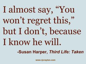
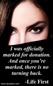
 You’ve probably seen them. You may even have shared them: an image that contains a really cool quote.
Last month, Jim Devitt told us that images get more interaction than text, so turning text from your novel into an image is a great way to increase reach, while getting out word about your book. Image quotes also allow authors to interact on image-based social media (like Pinterest) with something other than their book covers.
If you think image quotes are something you’d like to try, here is the skinny on what you need to know to make it work.
Can Any Author Do This? Yep. Image quotes are great for both fiction and nonfiction authors. It may be most effective for nonfiction books, as they can include useful tips that people want to share, pass on and read more about (I’ve seen a lot of self-help tidbits as quotes). However, image quotes are also a good way to showcase fiction, so long as you have good content (see next point).
Picking a Quote – This is the hardest and most important part of the process. (The Evil Mastermind wrote about choosing a book excerpt – much of the same logic applies here.) You need to find a quote from your book that is tantalizing, fun or intriguing enough that it will catch people’s attention and they’ll want to find out more and/or share it with others. With fiction, the quote can be either narrative or a quote from a character. For example, this would be a great image quote: “Tact is the ability to tell someone to go to hell in such a way that they look forward to the trip.” This quote, however, is attributed to Winston Churchill (while I love the quote, I still have no idea how to accomplish it; I guess I lack tact). My point is, if your characters have great, spitfire sayings/advice, showcase it. Anything that’s eye-catching (and appropriate for general audiences; no porn scenes, please) will work. If it’s nonfiction, pointers or tips always make great quotes. If you’re looking for examples of quote content, check out our own Big Al’s Facebook Page.
Quote Length – It can’t be too long. People don’t want to read a novel as a single image. They want pithy, newsbite-sized pieces. Go for fewer than 35 words. Before posting, look at the image quote to see if it’s easily legible. Does it seem too dense or the text too tiny? If so, cut down the quote or get a better one. In the span of a novel, it can be hard to find short quotes that make sense without reading the surrounding text. However, it’s worth doing if you’re going to make an image quote. (If you can tweet a quote, you can manage this.) If you do a lot of cutting to get your quote to fit, be sure to run it by someone who hasn’t read the book to make sure the reduced quote makes sense (sometimes we can be oblivious that we’ve cut necessary context).
Take Credit – With Pinterest, Facebook, Instagram, etc., once an image gets shared, it’s often difficult to figure out where it originated. So, it’s important thing to tag your image. I’m speaking of tagging in a graffiti sense, not a keyword sense. You need to put your author information somewhere on the image. The quote will be the main text, but somewhere in the periphery, include your URL or author name. Most people aren’t going to go track down your site based on the quote, but occasionally someone will. They’ll like the quote so much they’ll want more and be prepared to type in your URL or Google search your author name. But they can’t do that if you don’t provide them with a starting point. A URL is probably the best way to tag your image, so long as the URL isn’t super long. Remember, tagging the image with your URL is so people can find you — the originator of the quote — when they read it on a site that has nothing to do with you (and that’s a good thing, because that means your quote has been shared a lot).
 Design – Most authors are not graphic designers. For quotes, you don’t have to be. However, you do have to use some common sense. Make the font big enough that people can read it. Don’t use hard-to-read fonts. San serifs are often easier to read than serif fonts. If you choose a dark background (brown, navy blue, maroon), don’t use black text. Instead, pick a light color, such as white or yellow, so there’s enough contrast that it can be read easily. Most quotes appear on a background that is a single color or something subdued, so the text is the most prominent visual. As that’s what seems to be working for a lot of people, I would recommend following that model. When you introduce things like clouds, mountains, or your favorite bird, you run the risk of it interfering with text legibility. You might be able to use your book cover or elements of it as a background, but remember that text legibility is more important than the background. If you have design experience, use it and do what makes sense. If, like me, you don’t have design experience, then keep it simple. If you’re looking for some examples of various image quote designs, check out the Timeless Literary Quotes Pinterest Page.
Linking – Let’s say someone is so enamored of the quote, they want to buy the book right that second. Well, you can provide a buy link using the method that makes sense for the social network you’re using to share the image. For example, Pinterest offers a description area. You might restate the quote, add a line of description about the book the quote is from and then include the buy link. On Facebook, the picture is going to show up as your status when you post it, so you may want to provide a more traditional status update, and provide the link in the photo caption. You can also take a hands-off approach and provide no link at all or just a link to the URL you tagged your image with (rather than a specific retailer’s buy link).
Image quotes are fairly easy to create, but we’ll post a how-to tutorial tomorrow showing step-by-step (with screenshots) how to make one using Google Drive, which is free online software available to anyone with a gmail account. See the Google Drive tutorial here.

Cool idea, RJ, thank you. Can’t wait to play!
Thanks, Laurie. They’re fun to do.
Excellent post, RJ. And thanks for the shout out. 🙂
Thanks Al. Your quotes are always so lovely, so I was happy to use them as an example.
I’d never thought of doing this – what a great idea! Thanks, RJ.
Glad I could suggest it for you. Good luck if you decide to to do it.
This is a great idea; now if I can just find time to work on it!
Couldn’t stand it; just made about half a dozen. Great fun!
Wow. Guess you found the time. That’s wonderful!
Brilliant idea. I see these all the time and hadn’t even considered doing one myself.
Thanks. Good luck with creating some of these.
Quotescover.com is a great tool you can use to make your own image quotes. I have used it many times!
You can change the background and the fonts and even the colours, too. It takes a bit of playing around with, but it’s fun to do!
Thanks for the tip, Lorraine. I’m sure a site like that makes it easy to get a little fancier without worrying that you’ll disrupt quote legibility.
This is perfect for my nonfiction books. Don’t know why I didn’t think of it since I created a bunch of twitter quotes for the book. Thank you RJ. I think I can get away with using the entire cover since it is so light and it is my own photo, and I use Paint Shop Pro, but looking forward to the Good Drive tutorial.
Glad I could be of help. If you have twitter quotes, they’re a perfect fit for this type of thing. Good luck.
Great idea, RJ! I’ll have to look into this…
Thanks Lynne. Definitely give it a try when you get a chance.
What a good idea, RJ. Thanks for sharing. Looking forward to trying it.
Glad you found it useful. Good luck.