
 Every year, you know what happens: authors rush to get a book out before the holidays. Many times, that means a quick book cover job that leaves a lot to be desired. Don’t be that guy. “But I don’t have time to do a professional-looking cover!” That is just. not. true.
Each of the book covers below were made in five minutes or less using Microsoft Publisher, free fonts from the Internet, and free images from Pixabay.com. You can find more information on how to do all of those things on our book cover resource page here.
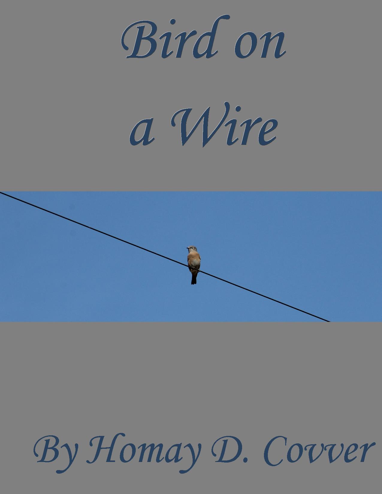
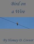
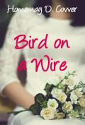
A typical “amateur” or “homemade” cover usually consists of a snapshot or lower quality photograph and text that is not effective in balancing the space or providing an idea of what the genre of the book is. See example #1 below.
 We’ve dissected the cover’s issues in the image below:
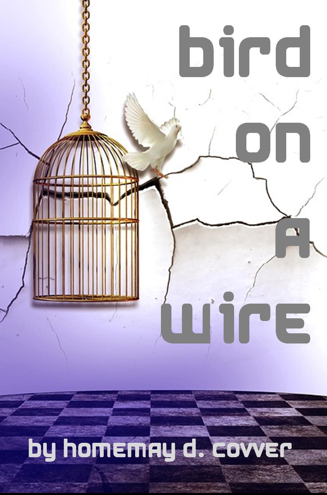
 Many authors would be inclined to “adjust” the above cover as a bandaid. Many times, we’ll see the cover below:
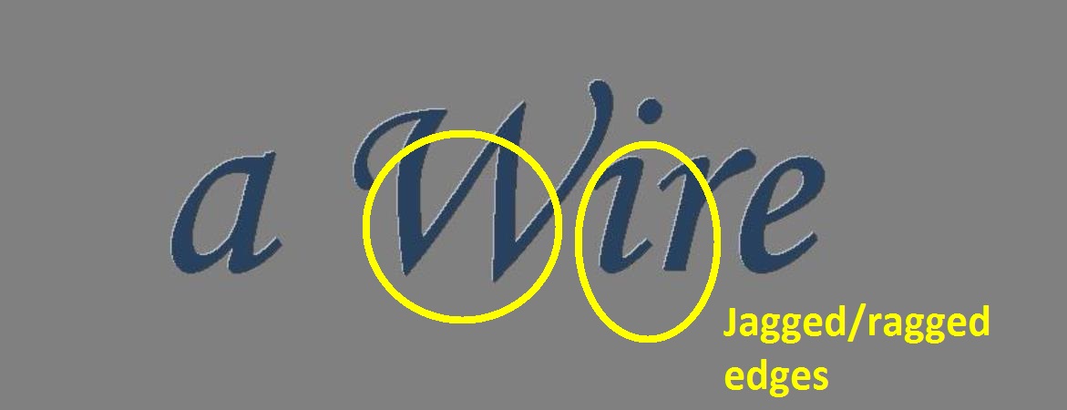
 This new version still has a homemade feel to it, and the font Monotype Corsiva, while attractive, is not a display font which is designed to look smooth in larger sizes. Here is a close up of the jagged/ragged edges on the title lettering:
Obviously, the problems this cover has are not solved by this new version. What is the cover’s genre? Switching out the photo, the colors, and the font in just a few minutes can make a huge difference.
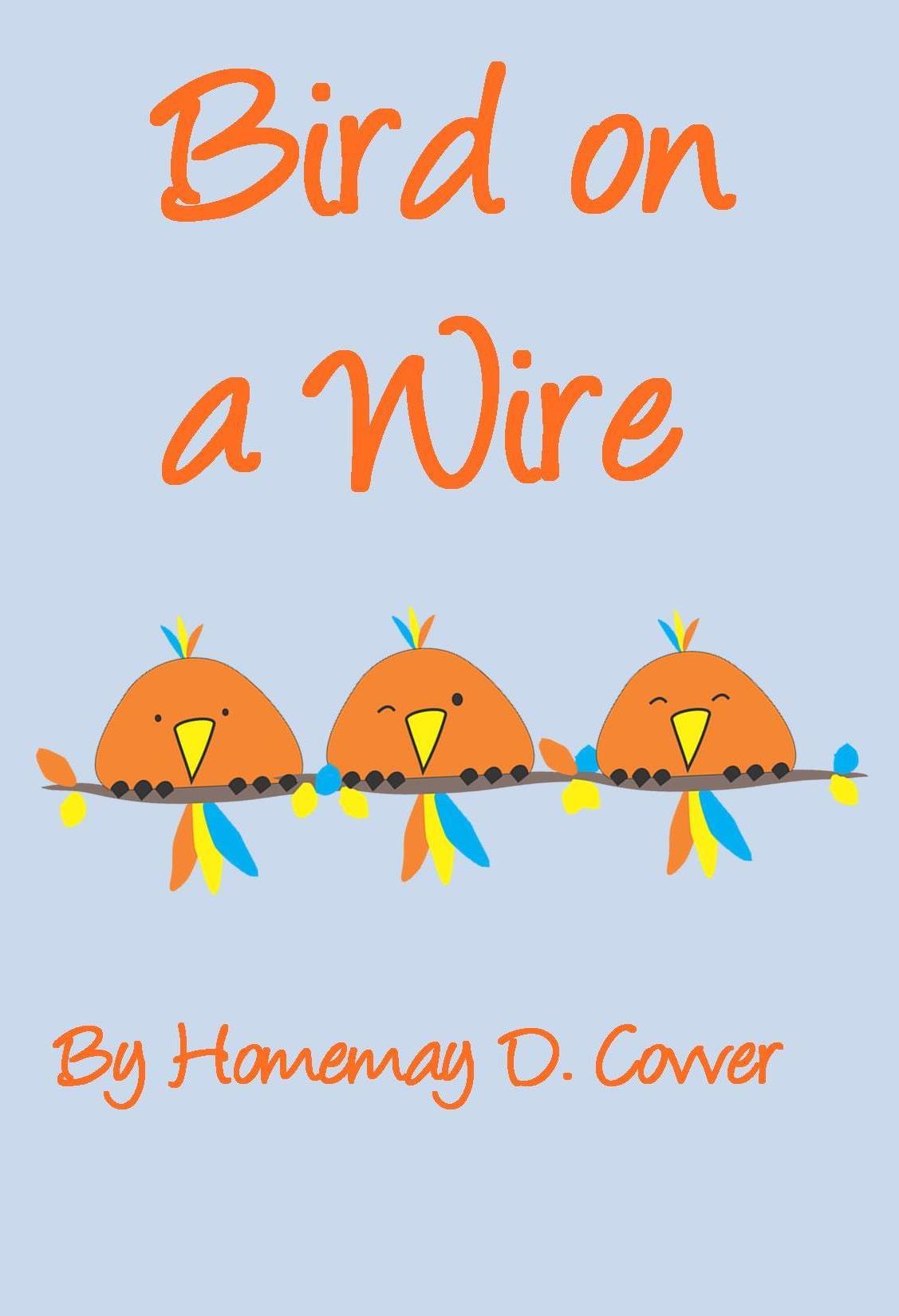
Grab some cartoon birds off Pixabay for free, download a lighthearted font, change it to matching, sensible colors, and voila, a cover for chicklit or comedy books:
 Writing fantasy? Just change the background color from baby blue to a color that works with your new image, get an image that represents the mood of your story, and download a free epic fantasy-style font.
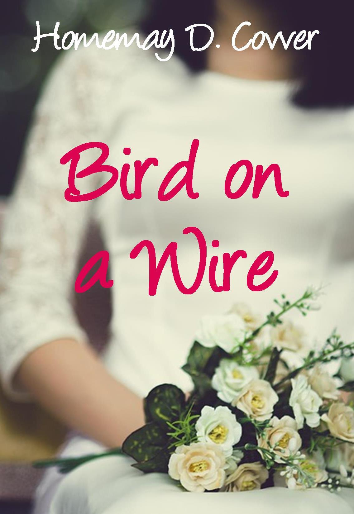
 The romance (women’s fiction, or romantic comedy) cover below was super easy. Just enlarge the photo (again, free, courtesy of Pixabay) to cover the entire canvas, then arrange the text so it is easy to read. Change the color to a “romantic” tone that has enough contrast and you have the cover below.
 Another example of enlarging an image (super neat one, too, thank you Pixabay) to cover the entire background is the literary fiction cover below. I downloaded a futuristic font and positioned the text so it wouldn’t interfere with the graphic.
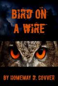
 The horror cover below was the most difficult of all of these (still took only 5 minutes, though). Without the clouds behind the title, there was too much “white space.” So I found another eerie photo, cropped out the parts I didn’t want, darkened it, and laid it in behind the title. You can do all of that in Publisher. It’s still super easy.
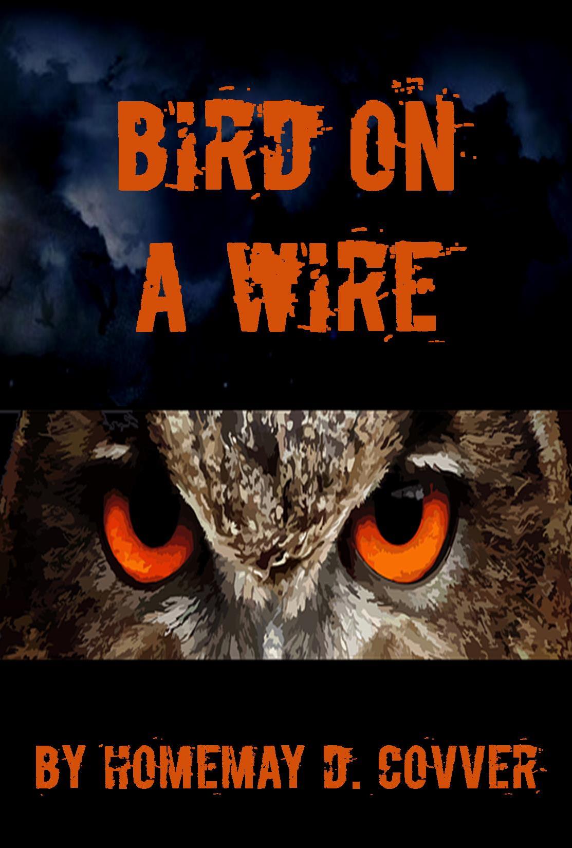 Publisher even let me match the color of the font to the color of the owl’s eyes. Pretty neat stuff.
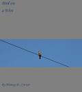
Now, the real test: how do all of these look in thumbnail?


Indeed! Thank you. 🙂
Thanks for stopping by, Linda. 🙂
Eye-poppingly good, Kat! Want to do mine? lol Just kidding. Sort of. 🙂
Hmmm…. if you make it worth my while… 😉
Those first couple make me cringe. Ewww.
Excellent. Then my work is done here. 😀
I was lucky enough to have a professional design for my cover, with a fabulous high-energy painting but I did not like the font chosen for the title. I changed it for a font the pro designer disagreed with. When the book was sold for translation in Europe, the traditional publisher there, went with the same font I’d chosen. I felt vindicated. The designer and I remain on great terms but continue to disagree over this font issue. He’s the design professional and I’m only a writer so I often wonder who was really right between the two of us. Maybe the book would have done better still with his font. I thought it looked too sci-fi ish but then there were slight elements of sci-fi in the story.
Yeah, Tui, I have to agree with you – not sure a sci-fi font aptly represents your book. Glad it worked out for you!
Extremely valuable lessons here, Kat. Those covers are no different than professionals would have put together (and charged a lot of money for.) You make it look easy. I don’t think you’ve given yourself enough credit for your professional eye here.
Aw, thanks, Candace! I just threw these together to prove that people can make nice covers without a lot of time or money. 🙂
I’m afraid the problem with Kat’s covers is that due to her experience and talent, she can do things in five minutes that some people can never do.
The other problem for the author/designer is that we’re so hung up on what we want and can’t get that we keep on trying until we lose our sense of artistic perspecitve, and settle for second best.
I spent days photoshopping a cover to get an effect I wanted, and my professional advisor looked at it for ten seconds and simply said, “You can’t do that.” Period. And he was right.
First off, thank you for thinking I’m talented. And you have good points. I’m directing this more at the people who would make the first covers (with the bird on the wire) in hopes that they’ll opt for the more professional looks later on in the article. Those covers did not require any photoshopping – just photos from Pixabay and free font downloads. I leave Photoshopping to the pros, for sure!
Great, quick tutorial, and you hit all the salient points. It’s not rocket surgery. Make sure the text is legible, create a mood with the image, and voila! Thanks for a great reminder.
Boom! You got it, lady! 🙂
I so wish I’d seen this before today! Something I’ll certainly take on board if I can ever be motivated to self-publish again.
Well, hopefully you will, Frank, and I hope it comes in handy when you do. 🙂
Get rid of the ‘by’ before the ‘author’s name’ and the end products will look even more professional.
Some very helpful tips here, for sure. I’ve been doing my own covers for ten years, and enjoy creating covers for others professionally. I would offer one word of caution: Unless an author is gifted in this area, it is generally better to seek the aid of either a truly gifted friend, or professional. However, even someone with a modicum of talent could create a good cover, utilizing the tips you’ve given.
Enjoyed the post! 🙂
Thanks, Joe!
This really encourages me to have a go myself. Thanks!
Great! Glad to hear it. Thanks for letting us know. 🙂