 In case you missed it, Amazon is now keen for its customers to display ‘Look Inside’ links to their favourite books, from within their own websites or blogs.
To be honest, I cannot see too many ordinary bloggers bothering with this feature, but for us Indies it could prove to be marketing gold!
Why? Because the ‘Look Inside’ feature gives casual visitors the ability to sample our work without feeling pressured to buy. Now I know sales are the holy grail, but nothing puts me off faster than a hard sell, so why do it to potential readers?
As I use WordPress for my blog, some of the following screenshots will be WordPress specific, but I assume other blogging platforms will work in a similar fashion.
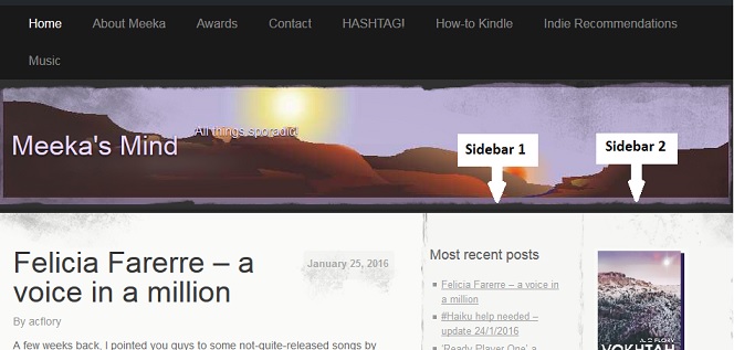
For those not familiar with WordPress, all the blogs are built around ‘themes’ which determine how the blog will look and what features will be displayed. In my own blog, I use the theme ‘Elegant Grunge’ because it gives me a main area for posts, and up to two sidebars for other things [as shown below]: Before the advent of the new Amazon ‘Look Inside’ feature, I used to display static images of my books in the second sidebar. Now, however, each image acts as a portal, taking the reader past the cover and into the actual book. What the reader sees when they get there depends on how the eBook was originally set up.
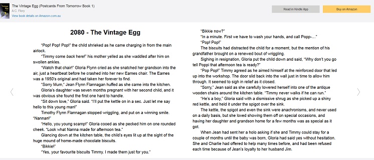
The most common way of setting up an eBook is to use the inbuilt Kindle ‘Go to’ option to navigate around the story. This is clearly Amazon’s preferred way of doing things because their new ‘Look Inside’ feature takes the reader directly into the story [as shown below]: Clicking on the arrows to either side of the sample allows you to navigate backwards and forwards through the story. Clicking on the controls beneath the sample [not shown] allows you to change the size of the font, while clicking the back button of the browser returns you to the blog. Very civilized.
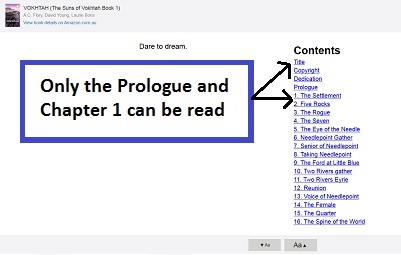
However, if you upload your eBook with a separate, clickable Table of Contents, as I did for Vokhtah, the situation is a little different, and the ‘Look Inside’ feature displays the book like this: As you can see, the reader has to select a chapter before they can read anything. Now, from a marketing perspective, this has two, distinct disadvantages:
- First, that an extra click means an extra opportunity for the reader to change their mind.
- Second, this is a sample only, so while the reader may see all the chapter headings, only the first few will lead to the story. Furthermore, clicking on any of the later chapters will take the reader to an Amazon ‘buy’ page, which is too much of a hard sell for my liking.
Another small disappointment was the ‘Read in Kindle App’ option located at the top right of the page. Clicking this option takes you to an Amazon page where you have to sign in if you want to have ‘a sample of this book [sent] to your Kindle Library’. Personally, I would prefer to see a simple ‘Save as’ option [which would allow me to save the sample directly to my computer].
Niggles aside, however, I am thrilled with the new Amazon ‘Look Inside’ feature and intend to set it up for all my books. It may not lead to increased sales, but it may lead to a greater awareness of my ‘brand’, and that can only be good in the long run.
In Part Two, we will look at how to install the Amazon ‘Look Inside’ feature [for WordPress blogs].

This looks cool, Meeks. I see I need to do a little maintenance on my book listings on my blog… 🙂
-grin- A woman’s work is never done.
This is a smart use of Amazon’s sample feature, but I’m going to have to pick a not and point out that it is not new. Amazon launched an embedding option several years ago. That one never worked very well, so no one used it (which is probably why you didn’t know about it).
Ah hah! Thanks for this Nate. I do actually remember ‘accidentally’ getting the ‘Look Inside’ once. I was doing a review of a book and copied the pic of the book cover directly from Amazon. As you say though, I could never replicate it and just dismissed the whole thing as some kind of glitch.
If you use a different blogging platform maybe you could do a review of the feature from a different perspective? No pressure. 😀
Welcome!
And making the ebooks pop out of a thumbnail in the sidebar really is a good idea!
I have a website and a Google blog. My books are linked to Amazon on both sites. Will clicking the links take a reader into the Look Inside? Also, are you suggesting we remove our Table of Contents from our eBooks?
Thanks for the post…and for clarifying.
Thank you for the heads-up on this – it’s exactly what I’ve been looking for. I’ve now got it implemented on most of the books on my desktop website (the mobile site is going to take a bit more thought…). What is really impressive is that it seems to automatically take account of the user’s location – sending them to the correct Amazon store rather than just the .com one. I’m now fiddling with customising the size of the preview window… such fun on a wet Friday afternoon!
Thank you!
I’m wondering if this will work on Blogger too…
Great tip! The only thing you might consider is opening the book in a new tab. The way you have the links in the sidebar set up now requires you to back up to get back to your blog. You can set up the open in a new tab link function by adding target=”_blank” in the html code.
Has somebody made this work from AmazonUK? So far: no good. Biut technologically challenged, here …