 As you are aware, the most common issue we see with books during the vetting process is an unclear or confusing book description. The second most common issue: unreadable titles on book covers in thumbnail size.
Who cares? Right? It’s just a tiny book cover. No one expects to read it in that size.
Um, wrong.
Just last week, our Lynne Cantwell wrote about the Marketing Rule of 7 – that it takes at least seven instances of someone seeing your book before they actually purchase it. Well – what if those seven instances are in thumbnail size? Do you think they will remember to purchase a book when they can’t read the title? Moreover, will they even notice it to begin with? Probably not. Don’t waste a chance to get in front of someone and make an impression.
Here at Indies Unlimited, thumbnails are generally 120×177 pixels, which on my laptop ends up being around 1.75 inches high by just under 1.25 wide. There is no specific industry standard for thumbnails, (on WordPress it’s 150×150) and the size varies from site to site. Then, add to it people viewing sites on their tablets and cell phones – and you can end up with some mighty small thumbnails. Can you read your title under those circumstances? You may want to check.
This is one reason I dropped out of a number of author groups on Facebook. People would constantly post “What do you think of my cover?” and I would answer “I can’t read your title in thumbnail size” and they would get all pissy and say “Well I can read it just fine.” Um, okay – you know what it says already. Of course you can read it. The level of frustration was ridiculous, since for some reason I really do care and really do try to help people (which prompted this post about book covers with just a teensy tiny hint of snark).
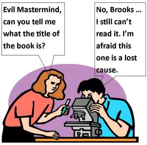
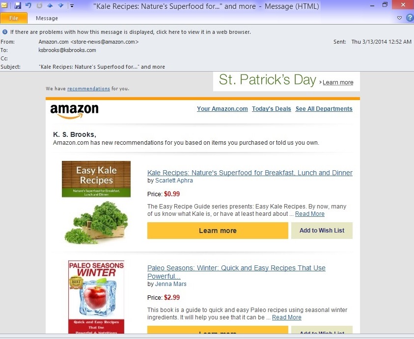
Seriously, I’m not making any of this up. Thumbnail-size book covers are the size most commonly viewed by shoppers. They go out in subscription-style reading list emails like The Fussy Librarian and Book Gorilla. They go out in Amazon.com “we think you’ll like this,” or as in the image below “Ms. Brooks, you need to go on a frikkin diet. We can see you when you’re on our site, so try these books.”
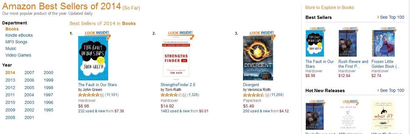
Of course, shopping sites also use thumbnails to cram as many titles as possible onto a page. Amazon jams twenty bestsellers per page, and then, don’t forget the even tinier thumbnails off to the right for the Hot New Releases, etc.:
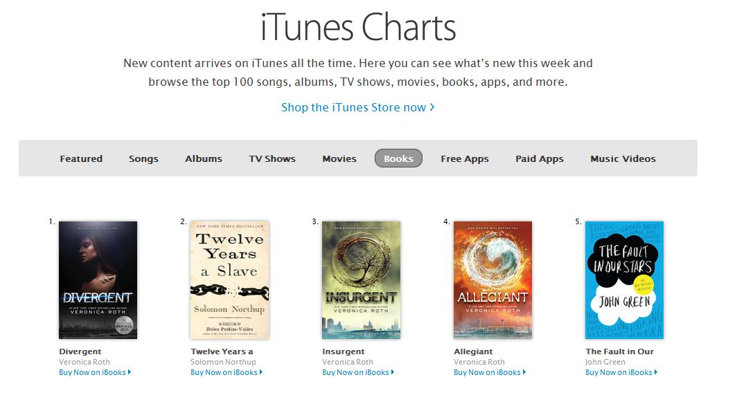
The standard thumbnail on iTunes is a little larger, but still…
And don’t forget Thrifty Thursday and Print Book Paradise here on Indies Unlimited (and our sidebar where you should…oops, I mean can pay to advertise):
Successful indie authors like Hugh Howey and J. A. Konrath have unmistakably legible titles:


Now, to prove the point about illegibility, unfortunately, I can say that most of the indie covers I’ve seen lately fall into this category. But, to avoid even more hate mail, I’m going to go with books from the bestsellers list on Amazon instead. I don’t know these people, and if they want to send me hate mail, I’ll reply with a copy of one of my books. With a note “notice you can read MY title. p.s., will you endorse me?” Because that’s how I roll.


Granted, some of these authors may just assume that their names will sell the books for them, but honestly – I can’t read their names either.
But I paid a designer to make my cover! Surely they know what they’re doing! Well – if you can’t read your title in thumbnail, perhaps they were more concerned with the design or aesthetics, and didn’t consider the potential impact on your livelihood. I notice quite often that authors and/or designers are reluctant to put type over a nice picture. Or, they blend the tone of the font in with the background. It’s as if they don’t want to disrupt or invade that space. How is the picture more important than your title, though? Kick it back to them. Make sure they do right by you, not just the design. Because really, do you want your cover remembered this way: “Besty, you should have seen the book cover I came across today on Amazon. Lovely hues of aqua and soft clouds – a very talented artist, I’m sure.” “Sounds pretty, Mabel. What book was it?” “Oh, you know? I don’t know. I couldn’t really make out the title. But the clouds were very nice!” Wow, that’s a sure sale if I ever heard one – NOT.
In any case, this should put this issue to bed for once and for all. It is obvious that I am correct, and that you should care very much whether your book’s title is legible in thumbnail size. Because I am right, and I am unanimous in that. You’re welcome.
This is so important – and so often missed or ignored.
This is great information, thank you for sharing. I’m slowly learning all the ins & outs of this indie pub stuff and without the experience of great authors (like you) we would all just have to learn the hard way … Thanks again!
You’re very welcome! I can’t stress enough how important this is. Thanks for listening. 🙂
Great advice (as usual)! Thanks, Kat!
The bottom line in this regard is what you mentioned; why miss an opportunity to put your title in front of viewers? If you think that being artistic will get you more sales than being visible in a lot of places, then go to it.
Think of Gordon’s 5% Sales Rule; if something makes you miss 5% of your potential market – there goes your profit margin!
So many of us writers are introverts, and we’re not comfortable shouting our names out, but here’s one place we really need to do that. I make a point of this in my self-publishing classes: make your name BIGGER! BOLDER! This is no time to be modest.
Great post, Kat. This year was the first time I really got into covers, and I can’t tell you how hard it was to get the title legible at thumbnail size. But it must be done. -sigh-
Not to dispute what you say–I agree wholeheartedly–but I wonder if the problem isn’t offset a bit by the fact that usually the cover image is accompanied by text that includes the title, author name, and blurb? Maybe people don’t look at all that unless the cover grabs them, of course. Thoughts?
Hey Dale, thanks for the comment. I may be missing your point here, but in regards to the image – that shouldn’t be the priority on the cover, the title should be. I see so many covers that it seems either the designer or the author didn’t want to obscure the image with the title. I’m not sure why that is. I cite specific examples in this article: https://indiesunlimited.com/2014/07/25/title-envy/. The image should be recognizable, for certain, but there are still plenty of covers out there which successfully accomplish legible title, author name, and image. The blurb doesn’t need to be legible in thumbnail, and by blurb, I assume you’re referring to the tagline. 🙂
If the site on which the books are offered will display only x-number of book covers because it only has x-amount of space, writers can’t do too much to make their own work more presentable. As Melissa states above, “BIGGER!” and “BOLDER!” are appropriate for your name. The tiny blurb beside the cover image could entice viewers to click on that image, which then (of course) takes them to the actual link where they learn more about the book. For me the verbiage in the titles is more important than what the overall cover looks like. But again, this goes back to the site offering the book. If will only display covers at a certain size, they most likely will display a writer’s name and book title in a certain font size without any emboldening. I’ve seen a number of web sites (not just for authors) where you can upload a photo, but it has to be within a certain size. Facebook comes to mind. Otherwise, what’s a writer to do?
Your post is so timely, Kat. For my second book, I’ve just finished working with my new cover designer, who kept telling me “This one really pops on the thumbnail…this one, not so much.” And I kept thinking, who really cares about the thumbnail? Now I know! Thank goodness my cover designer is one of the good ones!
Really appreciate your post; thank you!
That is great about your designer. Many of them focus on the artwork and not the title, so you’ve definitely got a good one!
Excellent post, K. S.
I agree that the author’s name should pop, too. A search for Stephen King or Dean Koontz on Amazon shows their names (in most cases) larger than the book titles. However, my last name, ten letters long, doesn’t lend well to this approach. Good case for a short nom de plume?
I don’t think you need a shorter nom de plume – I’d suggest putting your first and last names on different lines. I think that’s how the biggies do it anyway! 😉


I can’t get away with that with my name LOL
K. S.
Brooks
Hmm. Might not be so bad. Look at this one by A. G. Riddle:


I use the two-line approach for most of my books, but “Steinemann” doesn’t format nearly as well as “King” or “Koontz.”
That’s a nice cover.
I think Steinemann would look just fine. King or Koontz are kind of short. 😉