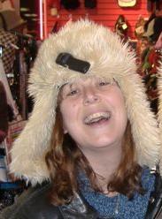
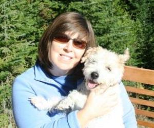
In the immortal words of the philosopher William Crystal “It’s not how you feel, it’s how you look…and you looooooook mahvelous!”

It’s true when it comes to presenting yourself to the masses. Your picture represents you. It’s how people will know you. You want to look good, right? And your book is your business, so you want to look professional, right? I understand that most authors are not also photographers. But I am. I’ve worked in conjunction with modeling agencies to develop portfolios for their models. I’ve done photo shoots for aspiring actors who’ve gone on to Hollywood and scored roles on 90210. Sure, I never got paid for that last gig, but what else is new? With that non-profit spirit in mind, I will now provide you with some “do-it-yourself” tips so you can end up with a nice looking press shot to help you develop your “brand.”
#1 – Do not show off the tattoo you got in prison, or anywhere else as that matter goes. Don’t wear flashy jewelry, no matter how proud you are of that new nose ring. These things distract from the subject – you.
#2 – That photo of you at the pub crawl whooping it up? Or the one of you on the balcony in New Orleans? Um, yeah – probably not a good idea. If writing is your job – then the photo should be of you either writing, reading, or thinking about writing. If your job is testing breathalyzers, well then…
#3 – I don’t care if you write vampire, werewolf, shape-shifting or zombie books. Red-eye is never a good thing to have in a photo. Make sure your red-eye reduction adjustment is selected before you start shooting, or most software programs allow you to remove red-eye once you’ve uploaded your photo. If you have a detachable flash that goes on top of your camera – use that. The further away the light source is from the lens, the better.

#4 – No one wants to see up your nostrils. I know that may come as a shock to you, and although I understand your nostrils are quite sexy, it’s still true. The most flattering angle for a human face is to be looking UP at the camera. So whether you are shooting it yourself, or someone’s doing the portrait for you, make sure the camera is up higher than you are.
#5 – Leave the special effects to George Lucas. Morning and afternoon light will be the most complimentary, so take advantage of those. The noon-day sun tends to make people squint and will cast shadows which can be undesirable. If you’re using a filler flash, then go for mid-day, if that’s when you have available.
#6 – This is not the time for action photography. Neither you, nor the camera, should be moving. The picture should be in focus. A tripod works great especially if you have a remote control for your camera, or you can put it on a timer. Anything less than a clear, sharp photo should not be used.
#7 – Neither Halloween nor the clown convention are good opportunities for your shoot. Make-up should be understated and done to enhance (or hide) features, not decorate them. No one really wants to look at Leona Helmsley, and unless you’re Brett Michaels or Captain Jack Sparrow, eye-liner on men is truly distracting.
#8 – Your “I’m with stupid” shirt is – um – just fabulous, but may I recommend something a little less wordy? Neutral tones are great, as is black, always. Try to stay away from white or busy patterns as they can cause problems with brightness balance and wreak havoc with your eyes.

#9 – Yes, you have a beautiful family. Your little monkey is just precious. Oh! That’s your newborn? Oops, sorry about that. Probably not a good idea to use your family portrait unless everyone’s name is on the book(s). Your audience wants to see YOU. If they want to know more about you, they can go to your Facebook or other social networking page where you can plaster whatever photos you want (within reason) of you and your posse.
#10 – Nice stall behind you. Are you in a bar restroom? Your flash is reflecting in a starburst off the mirror. May I recommend you try holding the camera up and pointing it at yourself – somewhere else? That’s the beauty of digital – you can take as many photos as you want, and if you don’t like them, you can delete them and it costs you nothing. Try it in front of a non-descript background, or perhaps some trees, a nicely colored wall, or something related to your writing. Remember, the focus should be on you.
Now before you get all uppity with me and remark how this puts a damper on your creative and eccentric persona, I’m just talking about a traditional head shot here, which basically cuts off just below your shoulders. Of course you can be creative, I’ve seen some fantastic non-traditional shots, but most newspapers and periodicals want a head shot so you should suck it up have one ready. That’s so much better than being unprepared or providing them with something less than professional. And if you’re going to be sending it out with your press releases, why not use that photo everywhere? That’s how you get your face known. That’s a lot better than the most wanted photos at the post office option.

Agree completely. The pic needs to make viewers want to look at your books. I was so lucky, the woman who took both my pics caught me at my best. I am normally not at all photogenic. Thanks Ann, kudos to you.
Having someone who knows you is a bonus. They know what's flattering and what's not. Your picture is fab, Yvonne!
Excellent advice from one of the best photographers I know!
Aw, thank you, Arline!
So that's a "no" on the baseball cap with the upside down beer bottles hooked up to a scuba mouth piece?
Depends, Ed – I don't recall any of your books having the title "Ozark Hands-Free Beer Consumption."
Halloween, you say? Dang. I never get this stuff right. 😉
I think you do just fine, Jesse!
I'll book my next photo shoot after the bandages come off. There is no amount of photoshopping that will fix the things wrong with me in close up. Do you have a number for George Lucas? I think I need some of those special effects. Nice article for attractive people, though. It's always interesting to read about the beautiful and talented people.
Ed! You just made me snort! LOL Um, these tips work for everyone, dear sir.
Another great article…I hope I got it right, give or take one or two. Lol!
Renee, all your photos are lovely.
Where's the thumbs up button? Great advice here. Having dabbled in videography, not much was new to me, but definitely very down-to-earth and valid points the average camera goer might not normally consider.
Thank you, Crystal!
Well said. If only I could smile…..
Great post Kat. I have had a professional portrait done twice for my online presence and business cards. The first one became outdated as I got different glasses, and I now use the newer (2 or 3 years old now) one everywhere. I'm wondering if I should have another one done. Since my cataract surgery I don't have to wear glasses now. But professional is the only way I get a decent shot of myself. Normally I am anything but photogenic and some photos of me are disastrous.
What a fabulous article. The advice is right on!
And so important for an author to know. Everything K.S. Brooks writes in her blog & for Indies Unlimited can really steer an author in the right direction–&, let's face it, this is a profession where a writer can use all the help he/she can get. Especially with all the changes–nowadays authors have to do just about everything themselves–in the last 20 years even. Instructional while entertaining! Perfect!
Great tips. As a "treat" for myself, I decided to do a Glamour Shots package. I brought a few sexy things to wear (not lingerie!!) and they did my make up and hair. I thought they did a good job and had some minor retouching of the photos to cover a few small blemishes I have.
Admittedly the price tag was ouchy (Over $2K) But I have lovely pics to use on my books, websites, and business cards. It's a good thing I don't age fast, I can use them for a LLLOOONNNGGGGG time!