 Welcome to NewsBites. You probably know we earned our reputation when one of our tankers, the Indies Unlimited Valdez, carrying a load of snark-enhanced truth, sprang a leak and coated random penguins with ugly, sticky facts. Or maybe that was just a dream I had.
Regardless, it is our job to drill deep down into the inky recesses of the internet and pump out delicious and nutritious truth. Then we strip out all the boring stuff. You’re welcome.
Indies rock. We rock as writers and we rock as human beings. Children’s author Jourden Cleghorn (Teddy O’Malley) was injured in a car crash. With mounting medical expenses and no ability for Jourden to market her own books, the Fun-tastics group, led by PJ LaRue, began an effort to promote Jourden’s books for her. They bought, reviewed, tweeted, and shared her books throughout social media. How cool is that?
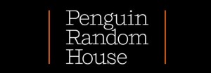
I am sure, like the rest of the world, you have been waiting with bated breath to see what the megaconglomerate Random Penguin House would choose as its logo. Rising to to the apogee of imagination and artistic vision that can only be reached by such a giant of publishing, here is what they came up with:
 Yeah. It’s just their name in print. Stunning, isn’t it? They think so, anyway:
“The basic idea and vision behind Penguin Random House is to find that balance and that synthesis between 250 creatively and entrepreneurially independent publishing houses and the leverage, scale, and possibilities and reach of a global player,” said Chief Executive Officer Markus Dohle in a video for Penguin Random House employees about the new corporate identity.
They made a video about a new logo that consists only of the name of their company. If you ever wonder why big ink offers such meager author royalties, there is your answer. You don’t get top-shelf thinking and corporate vision like that without paying a pretty penny. No sir.
In an unrelated story, a lawsuit has been filed in a U.S. court over the bazillions of bucks paid by Random House to an Australian publisher for the rights to Fifty Shades of Grey and its sequels. This is my favorite part:
But the court petition raises the possibility Hayward defrauded E.L. James, a pseudonym for Erika Leonard, and publishers Random House in signing an agreement on behalf of a company that did not own the publishing rights. Random House Australia has declined to comment.
You can read the whole thing at the Sydney Morning Herald. Is it possible for such a forward-thinking company as Random House to buy publishing rights from someone who did not own them? Surely not. I mean, a company with such an imaginative logo has to know what it’s doing, right?
This could be the time for big ink rival Hachette to spring forward and – oh, wait. Amazon has Hachette’s meatballs in the wringer. Come on, Amazon! Maybe Hachette is trying to save up for a cool, new logo.
That’s it for this week. I would like to close out with a word of appreciation to my co-administrator, the mighty K.S. “Kat” Brooks. There was a fire in my area on Saturday afternoon that burned up something called a DSLAM. That left me without internet for four days. Kat shouldered the responsibilities of running Indies Unlimited (cool logo to come) like Atlas. To the outside world, everything appeared to be running as smooth as ever. It’s almost as if I’m not even needed around here. And now I am a little sad.
Tune in next time, when we speak to the former CEO of a major publishing company who forgot to spellcheck a proof of the order for 100,000,000,000,000 business cards with a new corporate logo.

Oh Stephen, I think you’ve completely missed the subtext of the Random House Penguin logo. Since you brought up the Valdez, I recognized almost immediately that this is a Penguin coated in oil after the Valdez spill. It has washed up on shore, in front of a random house that is also completely covered in oil. And that serves as the backdrop or the new logo. It’s like a completely imaginative, creative logo. Had I not read you piece on subtext this morning, I might have completely missed it. Very deep, Penguin Random House. 🙂 Though, I must admit, the subtext of a penguin coated in oil is a little big gloomy and doesn’t bode well for the future. So, maybe I’m reading too much into it.
I am hoist on my own petard. It was bound to happen eventually at some point in the morning. 😉
Hmmm….Oily, slimy….Subtexts upon subtexts!
I sense a hidden meaning in your comment. 😉
Sometimes a comment is just a comment. Or…is it? 😉
I love you guys. You made my Friday morning!
Thanks, Lea. 🙂
Stephen, you are the snarkiest! Kudos to Kat for holding down the fort; you guys both rock!
Thanks, Melissa. 🙂
Aw shucks. Thanks!
Hey now, Random Penguin paid a lot of money for that Courier font.
Glad you’re back, EM, and kudos to Kat for holding down the fort. 🙂
Hello, thank you for your kind comments, Kat. Jourden continues to mend and the fabulous Fun-Tastics group continues to support her books and send well wishes to help her keep her spirits high. The group has worked together for Jourden and will continue to be there for her, as long as she needs it.
A quick clarification though, the idea to support Jourden’s books came from one of the group’s administrators, Elias Zapple. But, I do have a few tricks up my sleeve that I’ll be revealing soon.
I love these posts. Look forward to the next one.
Welcome back, EM. We m…ust catch up for coffee. 😀
I used to like Penguins. They are actually rather nice chocolate coated biccies that dunk beautifully in tea or coffee without falling apart. Chew off opposing corners and you can suck up your drink as if through a straw, adding that subtle chocolatey flavour and amusing yourself while you dodge the next tedious task waiting on your desk.
But if Penguin Random House have abandoned that catchy little black and white bird on their books in favour of a boring black splodge with words on it, then I’m going to boycott! They got rid of those nice, stylish coloured bands on the cover which told you what genre the books were long ago and it took years to get used to the new semi anonymous style. But now, getting rid of the cute little birdie is just too much. I’m done with them.
I might, on the other hand, reconsider if they offered me a decent contract with a fat advance to take over publishing my books. After all, one must never completely close doors….and who cares about their pesky logo? It probably only cost a quarter of a million pounds to design; money that could have been paid to new authors for exciting books.
Mmmm… penguin. Breakfast of champions!
More like breakfast for hungry seals and sea lions!
Since that publishing house’s choice of new authors they include in their lists is apparently entirely random, perhaps the new name is appropriate.