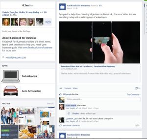
 Facebook is changing their look again. This time, the “Pages” receive the makeover. Seems like they’ve been paying a lot of attention to the function and look of the “business page” aspect of Facebook ever since we started sharing here on Indies Unlimited.
I’m sure you are all very comfortable with the look and feel of your Author Pages by now. Well, say goodbye. This week, Facebook will roll out the new “Streamlined” look for Pages. The biggest visual change will be a one-column timeline of your Page’s posts. This means that your posts will appear consistent on your Page and in the News Feed.
I’m not too keen on the new look. This major change limits the “visual” aspect of your Page to one column and requires more browsing from your readers to catch up on content if the reader hasn’t visited your Page recently.

On the plus side, the left-side column will feature your Page info including contact info, photos, Apps and more. Here you can see a collage of recent photos in one place. As you continue to add great visuals to your Page, your readers will be able to click on them to take them straight to the post. This might give your content added visibility for the occasional browser to your Page.
With the Apps now on the left-side column, this might also offer a chance to get your newsletter signup app in a better place. Most apps in your tab on the current format get lost. I think that the new format offers increased visibility for those types of functions.
As an admin to your Page, you’ll find the tools more accessible to see current stats and notifications in the “This Week” section on the right-side column.
A new function, Pages to Watch, is rolling out with the change. This could prove interesting. If you are a hard-core Facebook Page publisher, you might have fun with this new tool. Pages to Watch allows you to populate a list of other Pages that you want to watch or compare performance against your own.
So, if you want to compare your own Facebook Page to … let’s say … Indies Unlimited’s Facebook Page, add them to your list. On the “Overview” tab, you’ll see key stats, and a new feature to view the past week’s most engaging posts of your “watching” Page.
As always, Facebook is rolling out the change a little at a time. Eventually, you’ll wake up one morning and your Page will look different. If you haven’t noticed it yet, you can join the waitlist for the change by clicking the link just under the admin panel on your current Page.![]()
Once the change has occurred for you, it’s important to review the placement of the apps and other info in the left-side column. Make sure that your important links and apps receive the visibility they deserve. Fortunately, the changes don’t require much time on your part to redesign, because if the current environment holds true, they’ll be changin’ again real soon.

Good information to have – thanks, Jim!
Thanks, Melinda!
Good to know, Jim. It seems like Facebook is always changing something (though I don’t know why). I really dislike the new look of my personal page.
That they are, always changing. Thanks for commenting!
Thanks, Jim – am now ready for the next facepalm
Thanks, Chris, and thanks for sharing around the interwebs.
Thanks for keeping us ahead of the curve with all the Facebook changes.
My pleasure, hope it helps!
Not only my page looks different, but the event page I set up for this coming weekend looks different to me. However, some of the attendees say the look of the event page hasn’t changed for them. I don’t know whether they need to clear their cache or what.
And you’re absolutely right, Jim — as soon as we get used to this setup, Facebook will change it. 😀
It doesn’t matter if your event page looks different or not, IT’s AWESOME!
Good luck with the launch, everyone should get over to your event page and check it out … https://www.facebook.com/events/485673318221212/
Thanks for the heads up, Jim. Seems like everyone wants to look like an iPhone. Hmm…
Thanks, Laurie. I never thought about it that way, but I think you’re right.
How did those guys get to be billionaires when they keep screwing up?
If you screw up enough times, you are bound to get it right. Now just leave it that way and stop trying to make more money!
The changes haven’t occured on my page so I haven’t see anything except the image above. Does the top section stay the same – cover photo, etc.?
Shirleen, They are rolling the changes out Page by Page, eventually it will come to you. When it does, make sure to double check the things above. The cover photo shouldn’t change as they haven’t made any changes to the specs on the pictures. Thanks for responding!
Thanks for this. I had noticed some changes to my FB page which I don’t like that much but they have messed so much with my personal page that I have almost lost interest in all of it, so will hold my fire and see what happens next on my author page. Appreciate this info. 🙂
Thanks, Jane. Nothing ever stays the same. You might want to see my post from a couple of weeks ago that gives us a little hope in getting some exposure on our Author Pages.
Thanks I will pop over. Good luck with The Card.
Thanks for the info!
Thanks for commenting, Sandra!