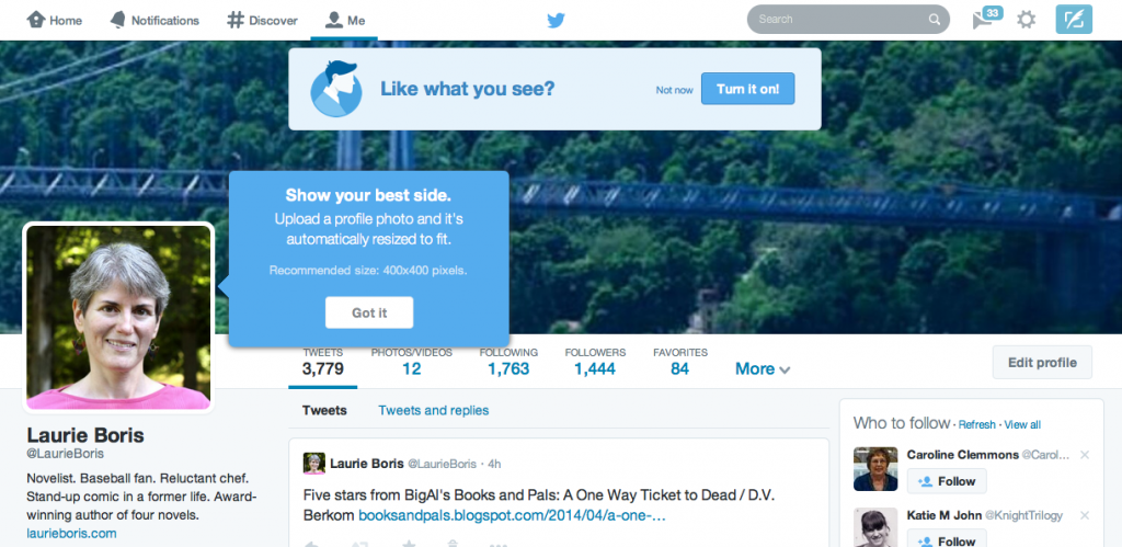
 If you’ve popped over to Twitter recently, you might have noticed a prompt to change to their new profile design. Again. Okay, I like change, especially when it comes in sacks of dollar coins or has a vague potential to up my visibility, so I bit. And I got this…
Wow. Way original, Twitter gang! So far, Twitter’s new profile looks an awful lot like Facebook and Google+. A big banner across the top and larger images…snooze…
But wait! There could be some potential here in creating a rough “sameness” to our social media sites.
For one, and argue with me if you’d like, we’re exposed to a ridiculous amount of input every day. Communications experts know this. And they craftily pursue ways to make it easier for our poor, tired brains to process the information so we’ll spend more money and/or attention on the things they want us to spend money and/or attention on. That could have been why early web page designs were set up the way our eyes naturally move and the way we are taught to read. And, a few years later, as we became accustomed to website navigation, most 24-hour TV news networks shared a spooky resemblance to a website’s home page. Websites have been continually chasing each other’s tails in an effort to not just stay competitive but to subtly (and sometimes not so subtly) try to reeducate our habits. The recent homogenization of social media design could be seen as an offshoot of that effort. Why not take advantage of that to allow your brand to appear more consistent across the places where potential readers can learn more about you?
Second, the new profile design, which ditches the background photo, could make your info easier to read. Yes, that same brain-saturation factor can once again work in your favor! Ever check out someone’s Twitter profile (the last most-recent version) to see that the user had plopped his or her bio in white text over a photo with a light background? Pretty hard to read, no? Jim Devitt warned us about this, way back when Twitter made that change, and apparently some users failed to take his advice. And if you only have a short time each day to spend on social media, would you rather fight through an eye-fatiguing design to see if that potential follow interests you, or follow the one you can actually read, process, and engage with?
Ready to pull the trigger and go for the new profile design? It’s not all that annoying to switch over, but here are some things you should know:
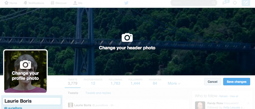
1. Your updated banner. When you opt in to changing your profile (look under your “Me” tab if the prompt is not automatically displayed across the top of your page) Twitter will ask you to upload a banner at a specific size (1500 pixels by 500 pixels). But it will still allow you to move and scale the image with some handy drag and slide tools. (You may have to play around with the sizes a bit; preliminary reports from Minion Central, via Rich Meyer, show that your screen’s resolution might play a factor in things not lining up exactly.)
I wanted a change from the background photo I’d been using on Twitter, and the proportions weren’t working for me, so I modified one of my Facebook banners (which I created in Photoshop) and loaded that.
Once you’re happy with the positioning, similar to changing a Facebook cover banner, click to apply but also remember to save the changes, or your image will disappear when you click off the page. And that stinks, especially if you’ve just navigated through your entire hard drive at midnight to find the right file. When I first made the change, this feature had a weird quirk. When I clicked off the “Me” profile tab and on my home page, a thumbnail of my basic profile info (banner, profile image, handle) appeared in the upper left-hand corner of the page. The banner image was truncated and distorted a bit, as you can see below.
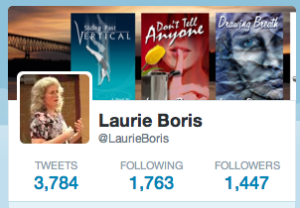
That bugged me, because the banner consists of four of my book covers against a background image. In the smaller version, one of my covers got lopped off. But a week later, this quirk seemed to have righted itself. If you see this truncation happening on your profile, choose a banner image that you won’t mind seeing cropped off on the right.
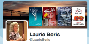
2. Your profile picture. It can now be larger—400 pixels square. I decided it was time for a change.
3. Work that pinned tweet feature. Yes, you read that right. You can pin a Tweet, like you can pin a status up on Facebook. Think about this a second. When viewers check out your profile, now that they can see more of your tweets as well as your personal info, what else would you like them to see? That you’re running a promotion? Have a new book out? Just started a new website? Get creative.
4. Take the opportunity to sharpen your profile info. We’ve had several great “aha” posts on how to add pictures to your Twitter profile, spiff up your bio, and direct users to your Amazon author page.
And our final product…
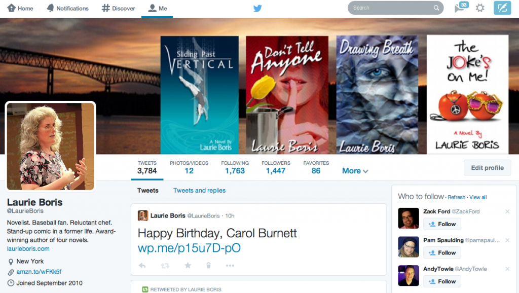
So what’s going on with your social media mix? Are you using Twitter? Do you think you’ll use the new profile?


Great. Maybe now I’ll actually be able to use it. 🙂
It really wasn’t that bad, once I saw the quirky stuff.
I don’t like the new look, why keep changing just as users get used to it? And why are some Tweets in HUGE fonts, seemingly at random? I hate the HUGE fonts, “shouting” at me.
Love the action photo, Laurie. 🙂 Count me happy that my social media presences will all look the same. I’ve been using my current book cover as my header/cover/whatever photo everywhere, but I will probably swap it out for a banner after the rollout for the third “Land, Sea, Sky” book.
Thanks, Lynne. Yeah. People see me and say, “Um, your hair grew really fast.” So figured it was time. Your banner sounds like a great idea.
I wasn’t going to make any changes, but gonna have to think about doing so now, thanks Laurie!
Btw, really like your new bio pic 😉
Thank you, Felipe. It wasn’t all that hard to spiff up.
Thank you, Laurie. I’ve just changed mine over to the new design following your advice.
You’re welcome, Ellie, and thanks for stopping by. I hope it works out well for you!
I’ve only been on Twitter for a couple months and I’ve been resisting the change but I need to take the time to do this. I’ll use the banner from my Facebook page. Thanks for the push, Laurie.
Have fun with it, Richard, and thanks for visiting!
I find tweets harder to read with the new design. Maybe I’m just completely opposed to change, but I don’t love the new Twitter profile.
Thanks for visiting, JP. Well, if past history is any indication, they’ll all change their formats again.
I was reluctant to switch over, but you have shown me the light, Laurie! The only thing I’d do to improve this article is to tell people HOW to pin their Tweet.
How To Pin a Tweet:
1. Select the Tweet you want to pin to the top of your profile page.
2. Click the “more” button on the Tweet.
3. Choose the third/last option: Pin to your profile page.
4. Click “Pin” when asked to confirm your choice.
Thanks again for this! I just pinned a Tweet to my snazzy new page. 🙂
Thank you, Lorraine, for the added info! Excellent. 😀
I am going to have to play with mine soon. Thank you for the info.
Ye gods, more gumph to change… social media… grumble grumble grumble… Just kidding, Laurie, sort of. Thanks for the great post.