 Perhaps in an effort to convince small businesses that Facebook fan pages aren’t useless unless they buy an ad (whoops – did I say that with my outside voice?), Facebook has instituted a new feature: a Call to Action button.
In marketing-speak, a call to action is the question or suggestion that gets you to do what the salesperson wants you to do: fill out a survey, sign up for a mailing list, buy a product, and so on. That’s exactly what this button does – and you get to pick what you want it to do.
Facebook is rolling out the feature in phases, so if you don’t see it on your fan page yet, be patient – it’ll get there eventually. When it does, you’ll see it in your page header. The IU chimp has circled it in green for us.
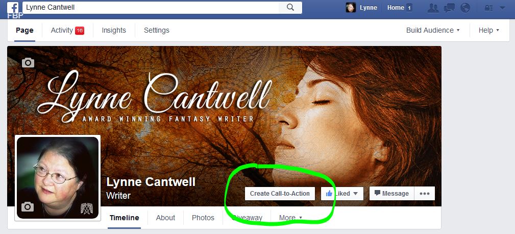
You may also see a pop-up box that suggests that you activate the feature.
Clicking the button brings up a dialogue box with a bunch of choices.
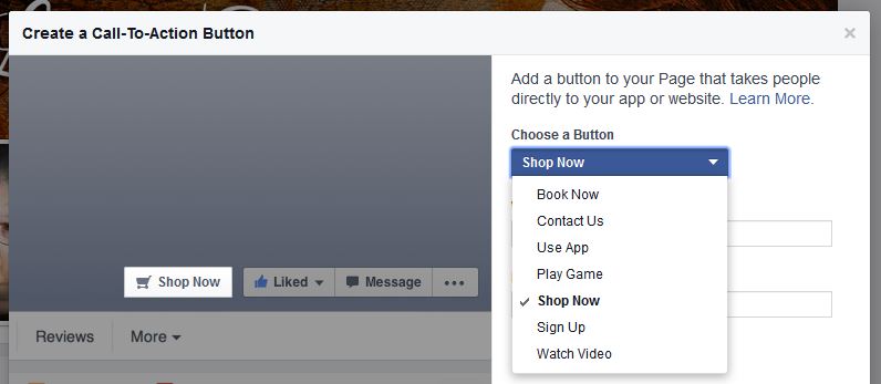
“Shop Now” is the default, but you could also pick “Sign Up” (for your mailing list), “Watch Video” (for your book trailers on YouTube), “Contact Us”, and so on. I’m going to stick with “Shop Now”.
Once you’ve picked your button type, you’ll see two boxes on that screen: one for a web address, and one for a mobile device web address. I think most places that have mobile sites will automatically shift someone using a phone browser to the mobile site. But if you want to make sure it happens, you can put your mobile site address in there. I’m going to live dangerously and put in just the address for my Amazon Author page. (And for once, I remembered to include my affiliate link! Here’s how to set up your own Amazon Affiliate account, if you’re interested.)
The next two screens ask you for more info about mobile access.
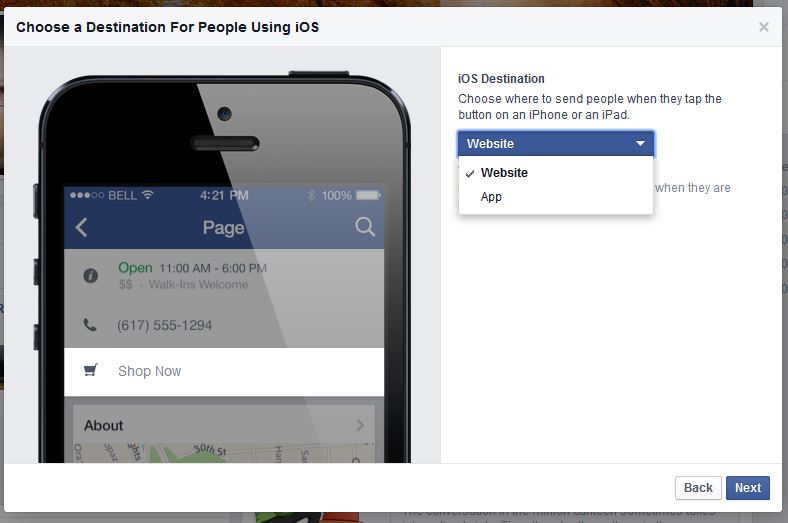
You get to choose whether to send people to the website, or to the website’s app. I debated about this and finally picked “website” for both iOS and Android. If someone hasn’t already downloaded the relevant app, I don’t want to distract them by diverting them to the App Store – I want them to get on with buying my book. But hey, to each his own.
Click “Finish” and you’re done.
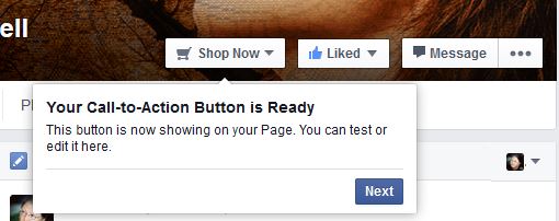
As you can see, the button has a drop-down arrow that only you will see. Clicking on that arrow gives you the option to go to the link, edit your button, or delete it altogether.
In the sidebar over on the right, you’ll now have a new indicator for “CTA Clicks”.
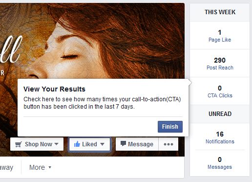
Facebook will keep track of the number of people who use your button, so you’ll be able to see whether you’re getting any action – and if not, decide whether to edit the button to do something else.
Now all you need to do is get people to your Facebook page, right?

This could be useful – if people actually use it. Thanks Lynne.
I think about 3/4 of the battle will be getting people to your page to see the button in the first place, Yvonne. But I figure it’s one more free tool in my arsenal.
I agree, Lynne, getting them to the page is the biggest battle. I’d be willing to guess that 50% of the pages I’ve liked I’ve NEVER been to the page (instead clicking like by hovering over the page name on my newsfeed and clicking the like button on the little box that pops up). I also guess that over 90% I’ve never been to the page since initially liking it.
I’m the same way, Al. I did pin a post to the top of my page to point out the existence of the button. Whether that will bring anyone in remains to be seen. Maybe this is a nefarious plot on Facebook’s part to get us to advertise our pages so that people see the button…
Fabulous! Mine just popped up last night. Looking forward to seeing if this works. Thank you, Lynne!
You’re welcome, Laurie!
Super helpful. Thank you for taking the time to explain this Facebook widget.
You’re welcome, Annette. 🙂
Wondered about that. Now I know. Thanks, Lynne–I’m going to share this with my publishing house.
Great, Kathy. Happy to help. 🙂
Great explanation, Lynne. I wish that FB had made the button a little more editable. I am using mine to send people to sign up for my mailing list, which will give them a free book. As it is, my button says, “Sign Up.” I would like to edit the button to read, “Free Book,” but can’t. I’m guessing that would get me a lot more clicks.
You’d think, Shawn. But I wonder whether they’ve done some kind of testing on what’s most likely to generate clicks.
Thanks Lynne. No sign of the button here in New Zealand yet that’s I’ve heard about, but I think it could be a useful tool to add to our arsenal. As always getting attention and getting people to go to our FB Page is still the hard task.
Good to know, Vicky. I’ve been wondering whether the button’s being rolled out to American users first, but it may just be alphabetical. Or something.
Thanks, Lynne. I chose Sign Up for now, linking to my blog page. I wish that FB would have allowed more options, such as a link to our author pages on Amazon. I tried–but as soon as I typed in Amazon, it said “invalid site.”
Linda, you can put in your Amazon author page – I think that’s what a good majority of us have done – and Lynne did that in her instructions. Did you copy and paste your link in? Did you try Shop Now?
What Kat said, Linda. I’d try picking “Shop Now” and linking directly to your Amazon Author page.
I dithered between that and a link to my newsletter signup page, and I may swap it yet. We’ll see how things go. 🙂
Thanks, Lynne. I’ve been wondering and hadn’t taken time to explore.
Glad to help, Helen. 🙂
Good tutorial. Thanks, Lynne. I don’t have it up on my page yet, but will keep checking.
Good luck, Dale! 🙂
Great tutorial! Thanks! I’m all set:)
Good to hear, Jacqueline! 🙂