 Google is changing its algorithm again. Unfortunately, this time we have to pay attention. On April 21st, Google introduced perhaps its most game-changing alteration to how it ranks websites than ever before. Forget the cute little Panda and Penguin changes that they instituted in the past, this one can affect your visibility almost immediately.
Currently, about 61% of total web traffic comes from mobile devices. With that in mind, Google’s changes might make sense. The algorithm change has to do with mobile search. This change will give top priority to sites that are “mobile friendly.” In other words, if your site or blog isn’t mobile optimized, you could lose up to a third of your traffic. The drop depends on how people search. You don’t have to freak out just yet, currently, the change only affects searches on mobile devices. If someone is Googling you from a desktop, nothing changes.
However, based on Google’s statement, “… will have a significant impact in our search results …” we should be concerned.
So, now what do we do?
Google has set up a mobile friendly test page that you can run any URL through to determine its mobile “readiness”.
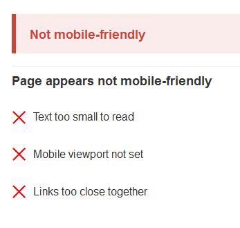
This will give you a report on where you stand. I took the liberty of running Indies Unlimited through the test page and here’s what I got back:  We are in great shape and Google will certainly give IU all the attention it deserves. Whew! I went on to try a few other URL’s that I was pretty sure wouldn’t fare so well, and this is what that looks like:
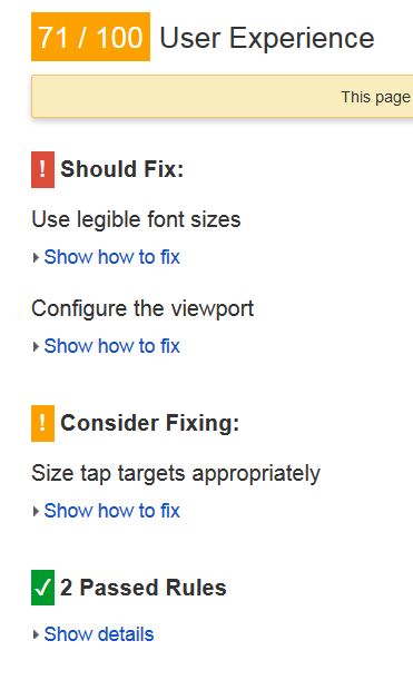
  Google is not trying to create enemies here. They are trying to give people a better search tool. With that in mind, they will not only tell you what is wrong, they will spell out the details. You can proceed to another link on the same page, PageSpeed Insights, that gives you a breakdown on how to fix the issues. For the same client above, you can see below the information that Google provides to help them fix the issues:
This is a great tool. Not only does it break down each thing that needs upgrading, you can click “show details” and it will pull pieces of your site to use as examples and let you know exactly what needs fixing. Size content to viewpoint is a big reason that many sites don’t optimize. That’s the ability of the site to fit in a mobile screen. In their Insights tool, Google even pulls the HTML code line that fails the test. So, if you know what you’re doing, you might be able to go in and make a few changes and be ready to roll.
If you’re using many of the standard template-driven platforms like Wix or Blogger, you’re probably in great shape. If not, don’t feel too bad, 67% of the Fortune 100 companies in the United States are not “mobile friendly” currently. How will that affect you down the road? Great question.
You will definitely be hit in search ranking without mobile optimization. The key is the extent that people find you via search keywords. Once you have things fixed, you can organically rebuild your search credit over time. In the end, we all want to have a site or blog that attracts fans and customers.
As easy as it is to blame Google for this new Algorithm upgrade, I believe it’s necessary. Technology marches on and the way people find stuff has evolved. Nearly everyone operates out of a mobile device. It’s no different than a changeover from records, to cassettes, to CDs, and now digital music. If you don’t change your product to the delivery mechanism, you will be left behind. Do I think this can ruin your opportunity? Probably not, because I bet most of you out there are already there with what you need. Let’s make sure we can jump ahead of the masses that cross their arms and refuse to change.

Duda Mobile will give you a mobile-friendly version of your website for free. All you need to do is go to https://www.dudamobile.com/ and click on ‘Create a mobile website’ and it will do the rest. Once you’re in you can alter certain aspects of your free mobile site. Alternatively you can purchase your mobile site for $159 for life and get a lot more out of it. But if you don’t want to you don”t have to. Just include the code they give you into your website index page, and you’re now mobile-friendly.
The code will redirect the search engines if they detect the user is working from a smart phone and your mobile version will show up.
Sounds like a quick and easy fix. My site came up not mobile-friendly, but I wasn’t in a hurry to take it apart and fix it. Thanks for the tip!
Thanks for sharing. The redirect concept will satisfy the Google Bots, but in actuality what is happening is there are two websites, one static and one mobile. The only time this really becomes an issue is when certain browsers on desktops are used to view a “mobile” site.
In the end thought, if you’re trying to be compatible, you’ve succeeded.
I really appreciate the information. I entered my author website, and it was not user friendly. I wasted most of my morning trying to make it so. I think I’ll have to reach out to a WordPress hired gun and see if they can correct the mistakes. So frustrating! But grateful for the information. When I googled my website on my phone, the first result was for the small press where my debut novel is for sale. Not my own website! Ugh…
Hey Annette – they have some plug-ins that will make your site mobile ready. I’m going to look at those because all four of my personal sites (not IU) are not mobile-friendly. Figures.
Uggh, poor Kat. It’s almost a catch-22, I’ve got one site I work with that has NINE incompatible plugins according to the Bots!
Yeah. I’ve got 4 sites, 3 different themes, and none of them are mobile compatible. WAH! But thanks, Jim. I wouldn’t have known to check!
Yep, this will be a mess for awhile. As Kat mentioned, there are some plugins available. Good luck and be sure to come back and share your successes!
One very quick way to fix it if you are using self-hosted WordPress and dont’t have the time to deal with finding a new theme is to activate the Mobile Friendly option in JetPack (and if you don’t have the JetPack plugin, you really should) 🙂 Mine came back as bad, just flipped that on and all good again.
I tried that jetpack setting but it didn’t work – or I didn’t wait long enough for the setting to take effect. I’ll check again today.
Thanks for the advice!
Awesome post, Jim! My blog is good, website not so much. Thanks for the heads up 🙂
My pleasure, good luck with the website.
Great post. Thanks for the info. I’m happy to say my site is mobile friendly.
Yay! We have a winner!
Thanks for the information.
According to the test, my site is not mobile friendly.
Nevertheless, I tried to log in using my iphone. When I entered my blog url, I was able to gain access. When I entered my website url, no results. This is confusing because my blog and website are linked to one site. Aaargh! Now what???
Wendy,
There is always frustration in this process. Depending on the blog platform, it might act differently than the site. If you are entering the URL, it should show up regardless, because that is an exact address vs. a keyword search. I would look at your website a little closer and determine how it is set up. There are about a million reasons that could be happening. Check out Carolyn Steele’s post a while back about seeing if you’re site is set up with keywords and such correctly https://indiesunlimited.com/2012/08/07/keys-tags-and-penguins-part-1/
Thanks, Jim!
My pleasure, JP.
When I read about the Google changes coming up I thought, hmm, I wonder if Jim is going to write an article on this. I’m glad I waited. As usual you spell it out in a manner that even I can understand.
Thanks, and mine is not mobile-friendly. One more item to add to the list.
Thanks for your help, Jim.
Thanks, Martin. Hope the transition to a mobile friendly site is going smoothly!