Until I was about thirteen years old, I had regarded reading as something of a chore. Then, one summer, while visiting family, my cousin gave me some books to take home with me. On the ride back, I cracked one of them open – and ended up reading all four during our 800 mile drive. These books really lit me up against all of my own expectations.
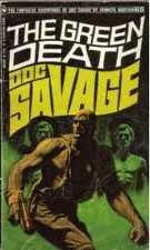
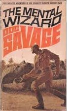
The Bantam editions of the Doc Savage series are the books that really got me interested in exploring the possibilities of becoming an author. Over the next few years, I read seventy-two of these books. Bantam published over 180 of them, at one time putting out one title a month.
 |
 |
 |

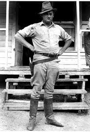
There is a complicated backstory about the Doc Savage books. The stories were originally published in pulp magazines in the 1930s and 40s. The author of the stories was listed as Kenneth Robeson, but that was actually just a house name. Though the preponderance of the stories were written by an author named Lester Dent, a number of other writers were involved and contributed to titles in the series.
Dent developed a master fiction plot, called the Lester Dent Formula. Essentially, his approach for producing highly salable 6,000 word stories was to divide the story into four 1500 word parts, each with steps for building the suspense and sense of menace to keep the reader engaged. Ironically, it was likely that formulaic approach that made it possible for other authors to step in and write additional Doc Savage adventures so seamlessly that the reader would never guess there was no Kenneth Robeson.
Dent died in 1959, years before Bantam revived the stories and re-invented them as a series of action novels. I liked the stories, but there is another element to the formula approach that I believe played an important role in the success Bantam enjoyed with these books.
Look closely at these covers. You see a distinctive, stylized type used in the title. You see the same character drawn the same way, differing only in pose. Same haircut, same manly physique, and interestingly, wearing the same shirt always torn in precisely the same way.
It was easy to walk into the local drugstore book section and pick these out. They popped. They caught the eye. You could tell at a glance without even reading the title that you were looking at a Doc Savage book and whether it was one you already had.
It enhanced the experience for me. When I read the stories, the guy on the cover was the guy I imagined. THAT is effective branding. That was as essential to the success and appeal of these books as the writing formula Lester Dent developed.
It is also an incredibly difficult thing to do well. People hesitate to commit to a particular cover artist, motif, title design, cover text placement, color palette, font, etc. Part of the reason for this may be that a number of us don’t like to be pigeon-holed in a specific genre. Let’s face it, a romance cover is probably going to incorporate different design elements than a sci-fi, spy thriller or zombie apocalypse book.
It’s going to be a chore to work your brand into the covers of books with different genres, but it is not impossible. The cover consists of a lot of different elements, not just print and picture, but the way everything is positioned, the typeface used, the balance of color, the number of elements. All those factors are in play when you consider how to send your readers a subliminal reminder that this book is by you.
This is one of those things that traditional publishing did that we indies may not have quite fully grasped yet, and may be something that would make a difference. You don’t have a team of marketing experts working with you to help get this done, but you can still focus-test a cover design with family, friends, fans, writer groups, etc. Stay open to suggestions. Pay attention to what people tell you about it.
Your cover is sending a message whether you intend it or not. Why not put some thought into what you’d like that message to be? Make it pop, make it work for you. The cover will catch a prospective reader’s eye well before your carefully crafted words have a chance. Make sure all the elements of your books are doing their jobs.

Great points. Love the link to his formula. I’ve been having this very discussion recently with a couple authors.
Thanks Tasha. I’m glad you liked it. I think the formula is interesting and still useful even today. 🙂
Especially important for series. The cover needs to be recognisable as blonging to the others in that series.
Especially so in a series – exactly, Yvonne. 🙂
Great information. I hate it when people complain about formula. If it entertains the readers it’s not a bad thing.
I agree. Sometimes readers need that comfort zone. It doesn’t mean everything needs to be predictable, but a lot of readers like to know they got on the right bus.
I discovered Doc Savage and The Spider in their original 1930s & 40s magazines. My mom had saved them. Despite yellowed and brittle pages, they were always a great read.
Those would probably be worth a fortune today, Neil. How cool.
Sorry Stephen, I never received notice of your remarks. In addition to the stories, I especially liked the advertisements, althe the only one that stands out 55 years later was for The Rosicrucians.
Interesting post. I used a formula of my own in Bad Spirits–each chapter was its own little vignette, with a cliff-hanger at the end–and I had to do it in 5k or less. I learned pacing and how to strip out nonessential elements. Formulas work. Just look at romance:-)
Love that, D.V. 🙂
100% agreed on book covers. Although, I feel a bit hypocritical since my current book’s sequel may end up having a different look with a redo of the first book’s done later. As for following story formulas, I have nothing against them(there’s a reason that certain story flow formulas exist – they work!), I just don’t feel that they should be a crutch or keep you from thinking outside of the box.
Oh gosh – me too. I don’t think I can say I’ve found mine yet, but I am certainly thinking about it.
I just never would’ve pictured Stephen as a Doc Savage fan … maybe the Shadow, but not Doc. 😛
LOL. Wanna hear me trill?
Good one, Stephen. Did you ever see Jose Phillip Farmer’s take on Doc. And Tarzan?
The idea that just using the type to brand is pretty cool, and not much discussed.
James Bond had similar “peripheral” branding… some of the book series picked up from the art in the films.
Another example that fits this is things like John D MacDonald’s Travis Magee series. Every title having a color in it. A cheap gimmick, maybe, but nobody would calll it that because the series was so good. Sue Grafton’s “A for..” series, too.
Excellent examples, Lin. Thanks. 🙂
Love the post Stephen.
It was important to me to stick to the same look and style for the covers of Fracture; same models, same fonts, etc. Jump forward to second book. I’m close to edit horrors (another story) so time for the cover, and poof, my model changes her look. Do yourself a favor. If you use the same models for more than one book, get several pics. I was lucky. She found some.
The title for two was another rant. Same title (which is not short by all means) and add another line. I think if my cover artist could have shot me she would have. I persisted. She caved. Its wonderful, lol.
LOL. Great story, Virginia. Thanks for sharing. 🙂
I agree with Lin about branding with type, that not many people think about it. I’ve made a conscious decision with the Pipe Woman Chronicles to keep the covers consistent — a black background, a fractalized animal photo, and consistent typefaces, one for the title and another for my name and the series name. The idea of carrying that branding across other series, and even other genres, is one I hadn’t considered yet — so thanks, Stephen.
I love your covers, Lynne. Great stuff. 🙂
Interesting stuff, Stephen, thanks. Since for the moment I seem fated for stand-alones, now I’m thinking of ways I can “brand” those.
Me too, Laurie. I’m not sure I have anything that would be considered a traditional series in me, but I still think it’s worthwhile to develop a recognizable cover style or brand. 🙂
Much as I understand the need for formula, particularly so in the teaching and or learning of something, I do feel that once that knowledge becomes inherent the formula should be abandoned, for fear of being predictable. In the case of a martial artist, predictability could be their death knell. In the case of an author, as far as I’m concerned (and many discerning readers, I feel), predictability is their death.
I have recognised the importance of some kind of consistency in the packaging of books of a series of course but, previously, not in stand-alones. However, I am now beginning to see that branding does make sense.
Thank you, Stephen, excellent post!
My Preston Andrews Mysteries covers all have different designs BUT my titles were all similar in that they used a play on the main character’s name–“Hard Press’d”, “Press’d to the Wall”, “Press’d into Action”, “Press On”, etc. which the readers refer to as the “Press’d” stories. Recently, I named one after the main character’s partner (Trace Evans) “Trace Evidence” and it took my audience a little while to figure out it was part of the series.
So, it’s not just the cover that works in your branding.
We do eventually learn. LOL
Interesting post. I personally don’t like predictability in my reading, however visual branding is a powerful concept and can work for and against a book or series. If I see a pneumatic woman on a book cover, with or without a hunky guy in the background, I move on so fast it’s almost subliminal. However if I see something that looks vaguely alien my focus zooms in [because I’m a sci-fi fan]. Will have to keep this is mind for the future. 🙂