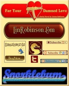
As promised, this tutorial will cover the making of buttons, logos, banners, and other graphic types needed by writers. Not as sexy an issue as covers, but very necessary. And it all applies: if you can create a cool-looking logo, you can create a cool-looking title and byline. In fact, if you examine this collection of images I think you’ll see that the difference between a “logo”, a “banner”, a “button”, and even a “title” is pretty abstract. What you’re seeing there, top to bottom, are: the title for an online serial, my personal logo I use for many things including “signatures” in mailings and forums, a custom SmashWords buy button, a dragon social media avatar, a Twitter button in custom colors, three RSS buttons to match three different sites, and a website header. All basically the same thing, using the same resources and simple skills.
And you’ll love this: it’s a lot easier to do these things. Your chances of learning, fairly quickly, to create good-looking, useful graphic doodads is virtually 100%. And there’s better news than that for those less than comfortable with all the talk of installing and learning graphics programs: you can do it all online without having your own programs, and it’s easier to do that way and at least as high quality! Cool, huh?
The big secret to all that is one of the greatest resources on the web, a site called CoolText.com. For one thing, it’s an excellent source of fonts. There are sites with more fonts to choose from, but none with a smoother, nicer download protocol. Browse their fonts by category and you’re sure to see some you can’t live without. But mostly it’s an engine, similar to GIMP but more sophisticated and fool-proof, for constructing the little visual gizmos we’re talking about here. As one example of the sort of high-flying stunts you can pull off with this free site, take a look at the “Buy Funny” button at the bottom of this page. Pass your cursor over it. Ooo and ahh. You can make a snazzy button like that in a matter of minutes.
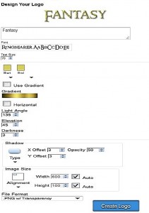 But CoolText is way more than gimmicks. This screenshot gives you an idea of the sort of interface you see when you click on a style from the main page. You can change what it says by just typing something in. Click on the font to open their treasure chest of typefaces and pick one. (If you like it, download it for your own use.) Change the colors, the shadows and outlines, the shape of button backgrounds, the rendering of the letters. All very easy, all “un-doable”, all straight layperson actions.
Let me point out here that you don’t really have to know what all those little boxes in the design interface mean or do. If you don’t change them you get what you see at the top. If you want to fool around, you end up learning that reducing the shadow’s opacity makes it fainter or what changing the type size from 70 to 300 does. Each change you make is immediately visible at the top and can be undone. You can’t really foul this up.
You can get too carried away. Having all this whiz-bang in your fevered hands can lead to going too wild and making logos that just don’t fit in. But you get used to it. And learn what works. For instance, you can only use the animated logos, with your name in leaping flames or “Twilight” sparkle, on a website, not an ebook or bookmark. Using a font that’s too fine or narrow to be seen in a thumbnail is still not good, even though you find some gorgeous script and can spin it into gold like RumpleFreakinStiltskin. There are size limitations, but I haven’t really found them yet. I’ve definitely done buttons big enough to be ebook covers.
And here’s one advantage of this site over using GIMP’s Alpha To Logo filter—you can set the background to transparent. Therefore allowing you to drop them in over backgrounds of any site or forum, or cover photos. I’ve illustrated the samples here on gradient backgrounds to show how transparency works.
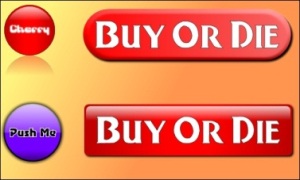 That unity between buttons, banners and logos is illustrated by the fact the CoolText no longer has two different pages for them. At the top of the page you’re seeing mostly “logo” stuff, essentially fancy lettering. Down at the bottom you’ll notice that the letters have backgrounds and are therefore “buttons”. The set-ups they offer are neat enough, but they are just guidelines really: you can have a lot of fun adapting them to a virtually infinite array of possible looks. I’ve used the little “Cherry” button as an example because it’s simple but versatile. Below it, you’ll see the same configuration with different type (not that the “Gravity Sucks” font isn’t elegant) and changed to blue with black letters outlined by white and selected “heavy”. The shadow is no longer “mirror” but “glow”. You can expand that glow or change it’s color. But look what happens when you change from “circle” to “rounded” and change the width from 150 pixels to 450 and jump the size of the letters. Now you’ve got a website button (with appropriate message to reluctant readers.) Change it to “square” and the effect from “three dimensional” to “gel” and you have a very different look. Obviously you can go far and wide to adapt just that one button to your needs.
A little screwing around (which most people find fun, not onerous) can hone you in to better output. The dialog boxes for using colors are highly simplified. You move a slider on a spectrum, then pick out shades from a two-dimensional fade box. But you can get more specific by using your GIMP or Paint.net program to get exactly the color you want (or pick a color from artwork you want to match), then just copy the six digit hexadecimal number for that color into the box on CoolText. You can create an outline for your lettering then set the text color to the same as the background and end up with outline lettering. You can create a button, then paste on a logo from a different configuration that isn’t set up for button backgrounds.
Once you get a button the way you like it, you hit the “create logo” button and it will appear with instructions on saving it to your computer, and html code for adding it to your site if it’s a rollover button like “Buy Funny”. Hit your browser’s “back” button and you can make more changes. For instance, you could create a whole set of buttons with different type on them. Like “amazon”, “Smashwords”, and “CreateSpace”, for instance. Or a set of social media share buttons.
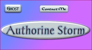 To get back to that “what’s the difference?” question, note this picture. The little “Ghost” graphic is shown modified to a site button, but what happens when it’s expanded into an “ellipse” with cute type? Now it’s a logo, a signature banner, maybe even a byline on the cover of “Authorine’s” book of breathless poetry.
You can also, if you’re into more advanced manipulation, create a blank button by spacing two periods apart to set the width, then brushing over them in your home program and pasting graphics on top of them, such as the machine gun on my “Damned Love” title.
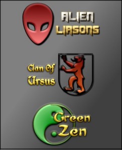 But let’s take a look at the true piece de resistance of this site, enabling you to do things that will impress your fellow writers, confound your foes, and bore your family. Look down at the bottom of the page for the “Seasons Greetings” logo. This one has pictures with it. You can change the ornament image to any of many hundreds of pictographs, as shown here. The images are rendered in 3-D and you can change the two colors of the gradient. You can also alter the color gradient, as well as the fonts and size of the lettering, then choose a layout to set the letters against the image. Pro designers will hate this, but I think you might agree that you can easily get results of a quality that would cost a pretty penny if you paid for it. Each of those little logos took me about ten minutes to crank out. You might not be able to suit your needs with the images at hand. But then again, you might. And it’s a blast poking around their collection. And requires no art talent or training whatsoever. If you can’t find an image you want, try creating that element of the logo on GIMP’s Alpha2Logo, then pasting it together with text created on CoolText.
Next time we’ll look at some specialized forms of buttons and banners that could be of help to you, and some ways to create and use them.

Very cool, Lin! Now I’m itching to play with this site instead of working. Sigh…
Mua ha haaaaa
I’m going to make a banner that says “But this book or I’ll hurt you.”
Thanks Lin! Great stuff (and of course, what Lynn said).
Awesome, Lin! I remember this vaguely from LinkedIn (you were the one who told the thread about this), but I forgot the details. I was searching for related info just yesterday, and now this post. Talk about timing! 🙂
Spiff, Lin, thanks!
Like what was said above. I’m bookmarking this post for after I get some other stuff done. Thanks for the info.
Thank you so much, Lin! This looks like a time-suck just waiting to happen. LOL Can’t wait!
@PETE. Hire someone to proof it for you, please. Or perhaps change it to “Buy this book. I have a Gub!”